Diario de Juárez
UI design + news website + re-design
Client
El Diario de Juárez is a news organization in Juárez, Chihuahua. It started out as a newspaper in 1976 and later on, launched a news site.
Role
Lead designer. We were assigned to propose a redesign concept of the whole website.
Year
2017
Company
El Diario de Juárez

My task was to redesign the entire existing website and come up with a better solution to showcase articles. This is one of the biggest projects I worked on earlier in my career.
Our team consisted of a webmaster, two developers and one designer. We were assigned to propose a redesign concept of the whole website. I was employed at this local newspaper as the only graphic designer on the web team, meaning I designed everything to do with the digital edition at www.diario.mx.
Problem
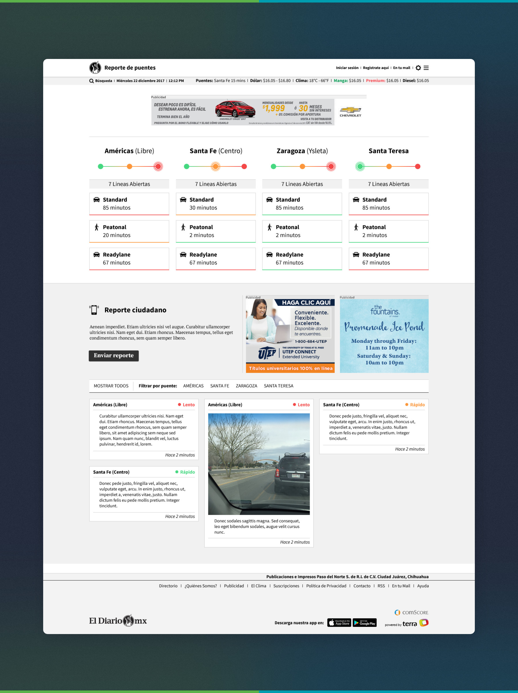
The website at the time was pretty basic, and we as a team wanted to take it in a new direction. Looking at the analytics and public comments on social media, the public mostly complained about the clunky design, and statistics showed people didn't stay long after reading one news story.
Another prominent problem was the amount of ads on the site (up to 12 ads in various sizes just on the landing page). This is something that could not be compromised on, and I always advised to reduce the amount. In this redesign, I needed to find a way to make the ads work with the layout.
Finally, the most apparent problem was an outdated style. The site needed to be updated and brought into modern times.
Goals
- Get visitors to stay longer; find better ways to drive attention to original stories and multimedia specials.
- Show information as clearly as possible.
- Show as many headlines as possible in the landing page (Requirement from higher ups).
- Avoid color in the actual UI (Requirement from higher ups).
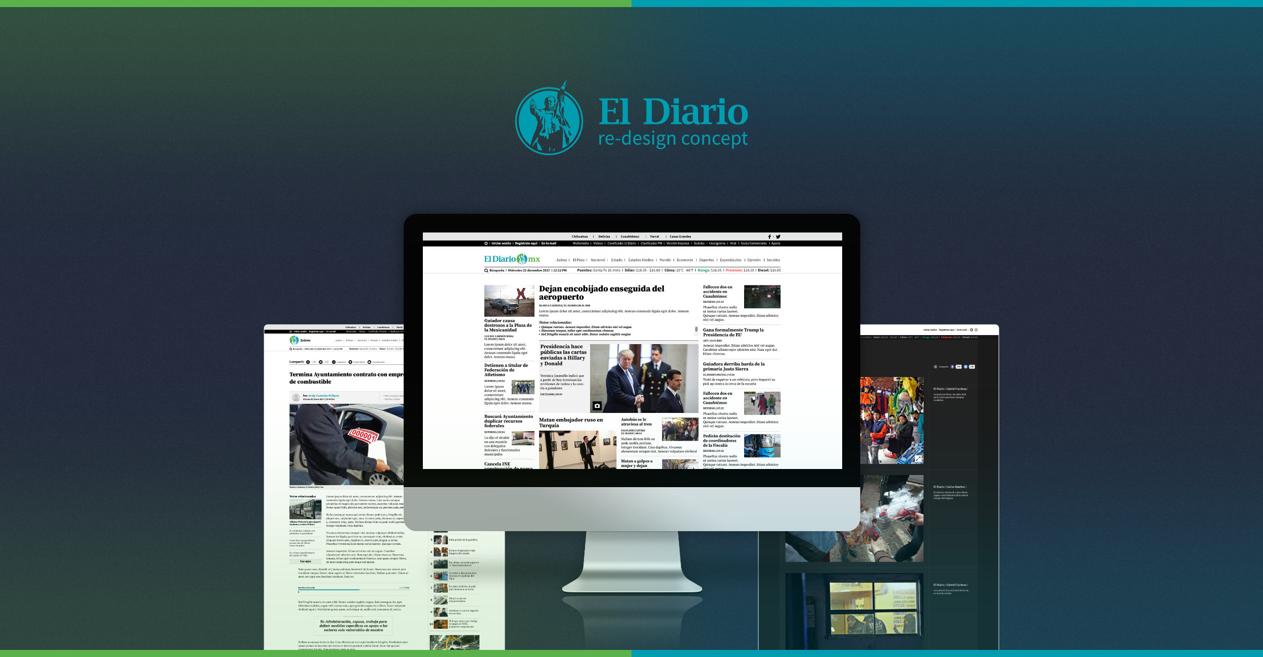
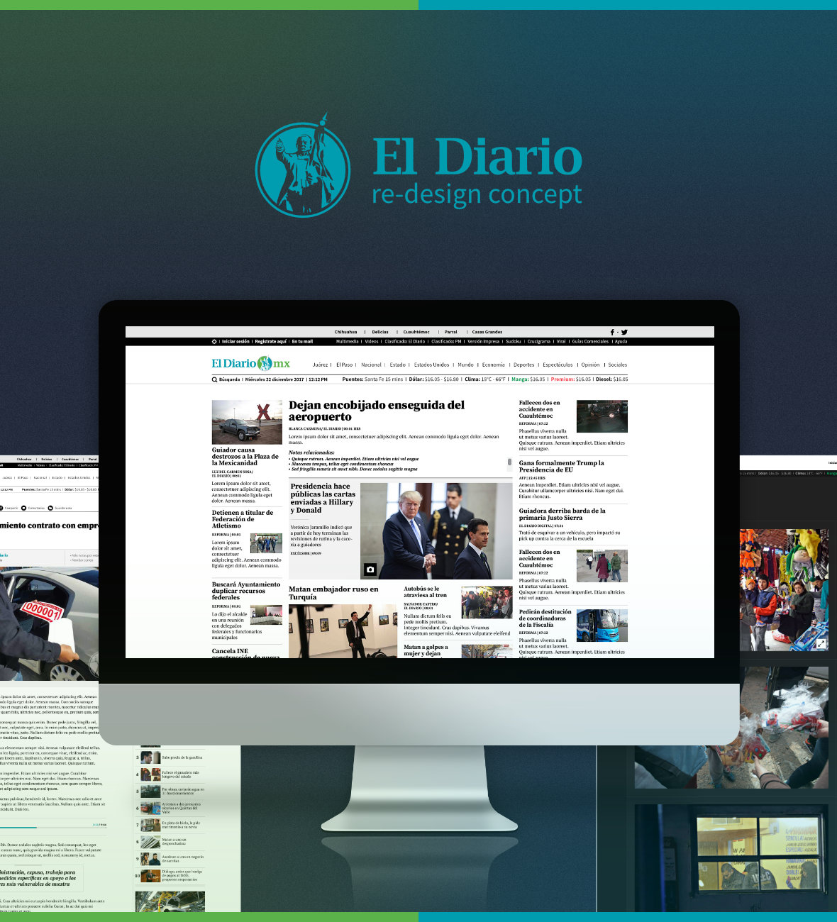
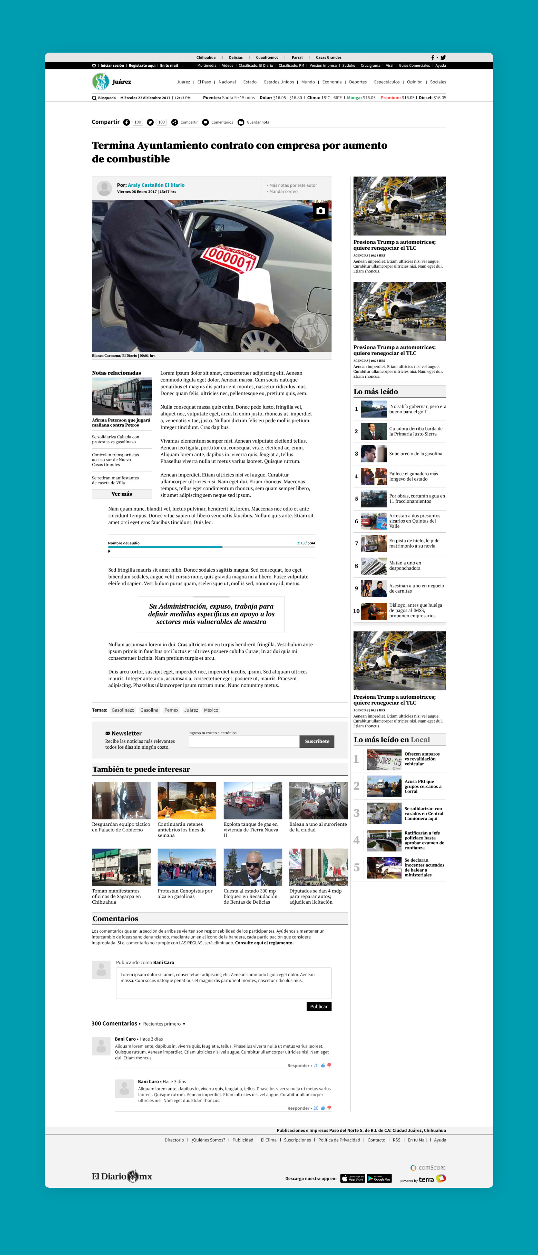
I experimented with various types of grids that would allow for three different sizes of articles. I ended up with a twenty-two column grid, where headlines could be organized in different sizes following hierarchy. The middle column, comprising twelve smaller columns, would be where the most prominent and breaking stories would lay.
Main page
My initial challenge was designing the landing page and showing every article in an organized manner. Like I mentioned before, I was required to put as many headlines on this layout. I understand the intentions of our higher ups, but this would definitely saturate the experience. I tried my best to structure everything and keep ads to the side columns to not draw too much attention.
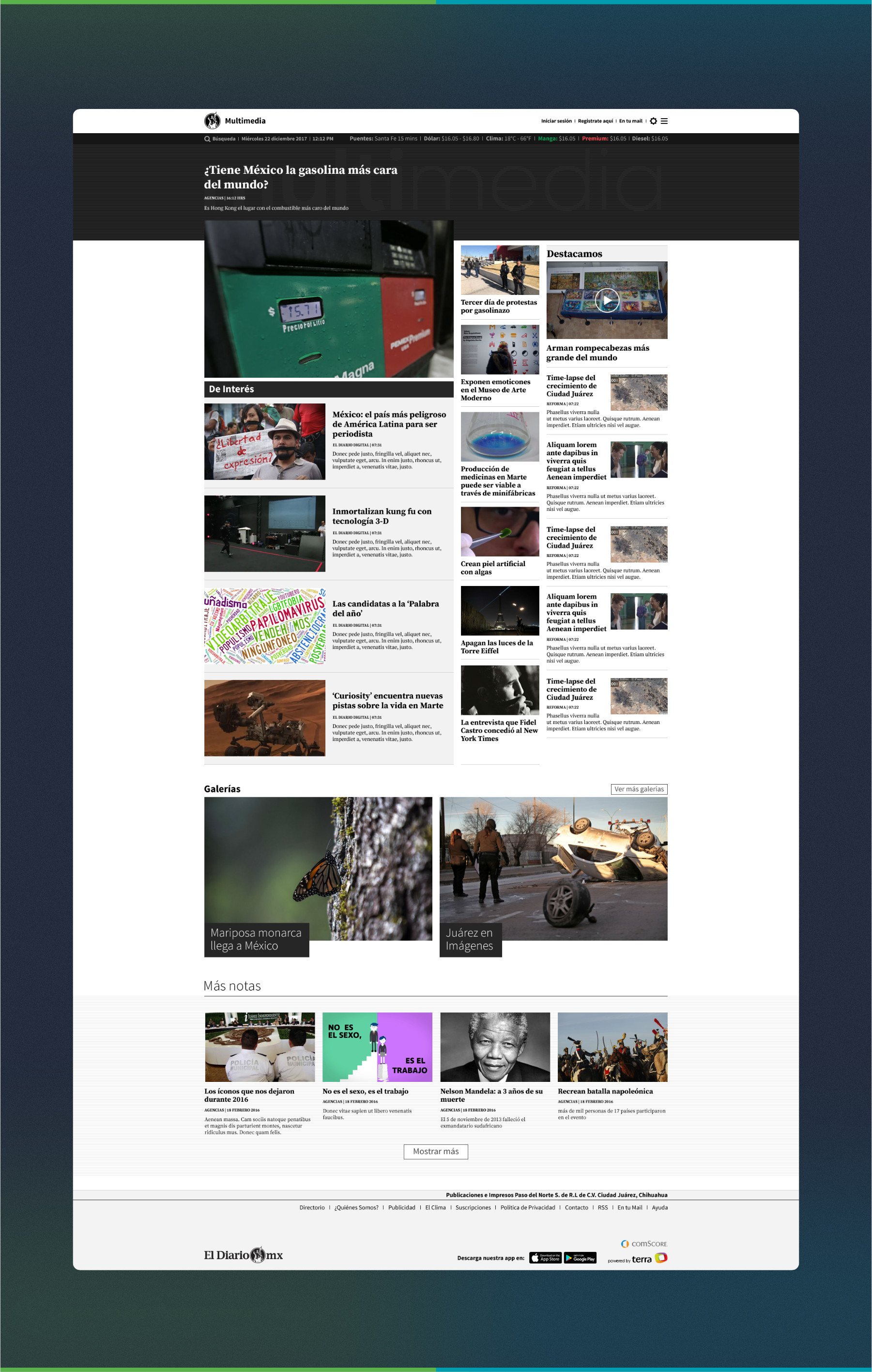
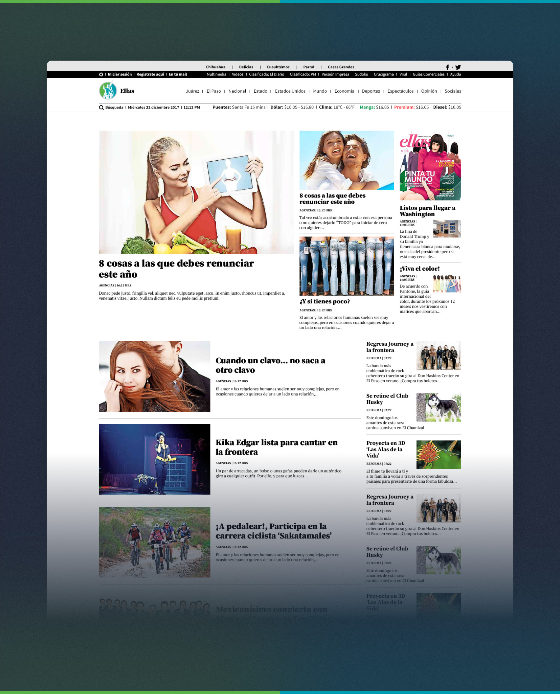
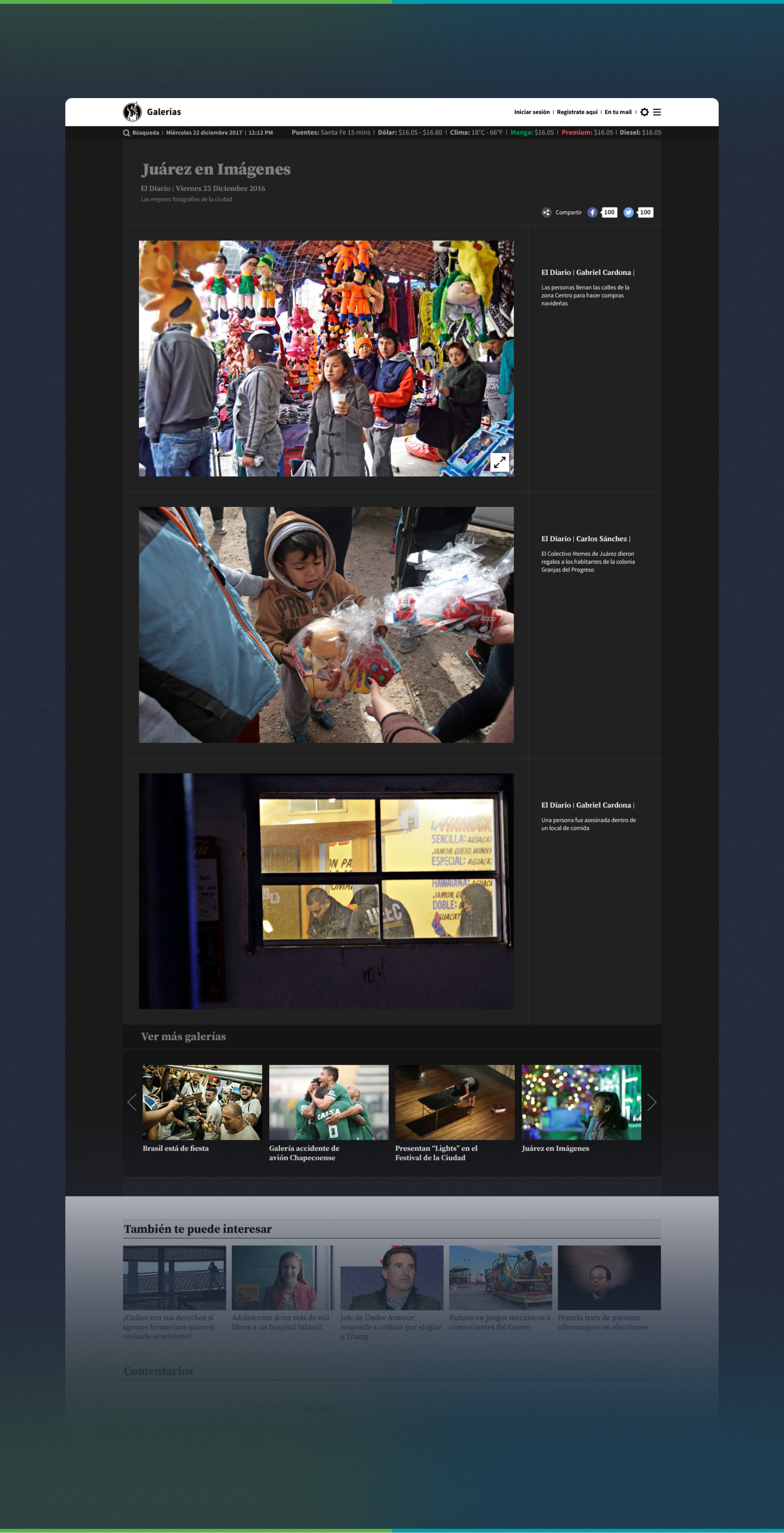
After establishing the general direction and style, I experimented with wireframes to determine all other screens including: main sections, special sections (like multimedia, galleries, border crossing times and entertainment)
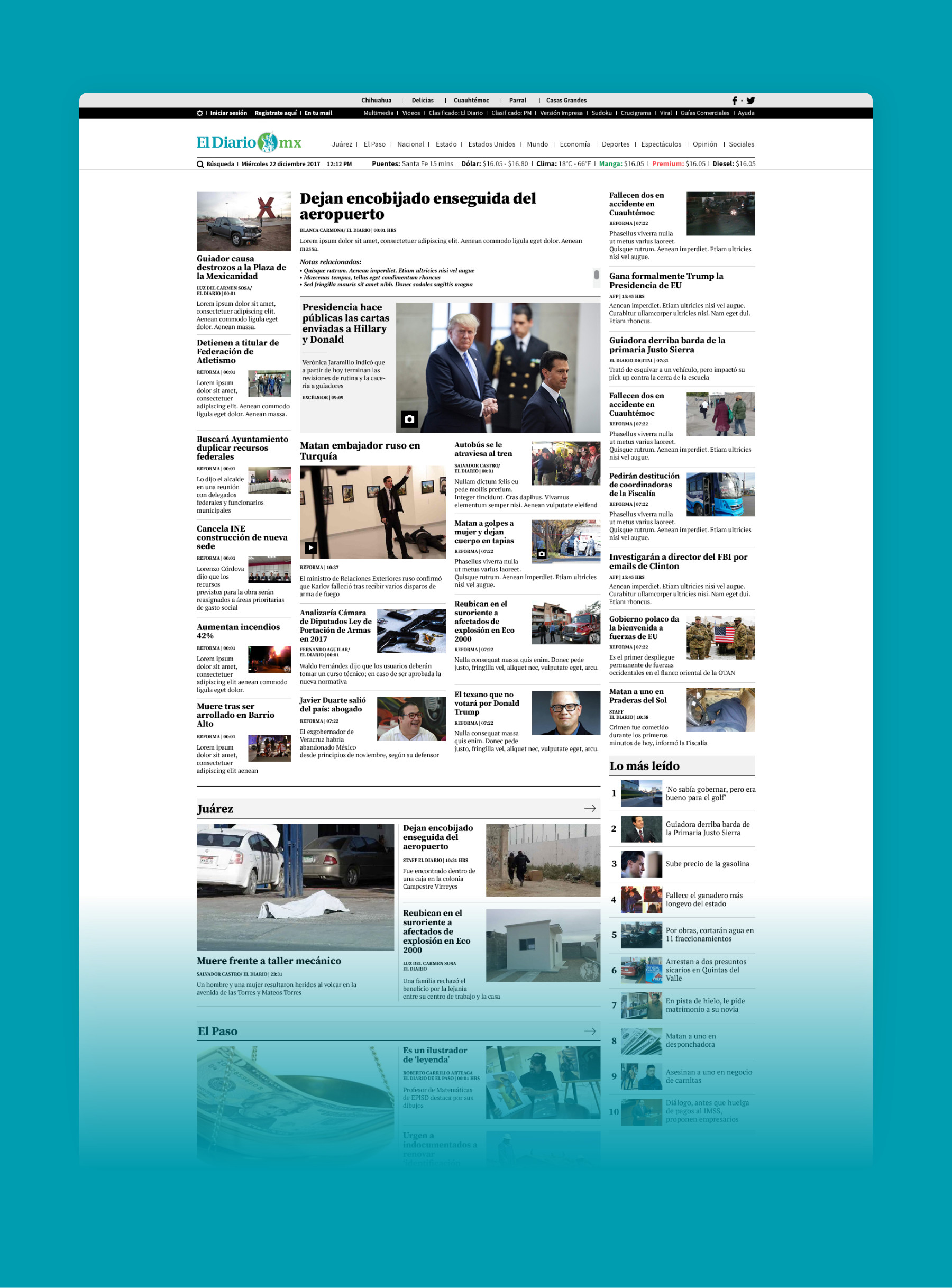
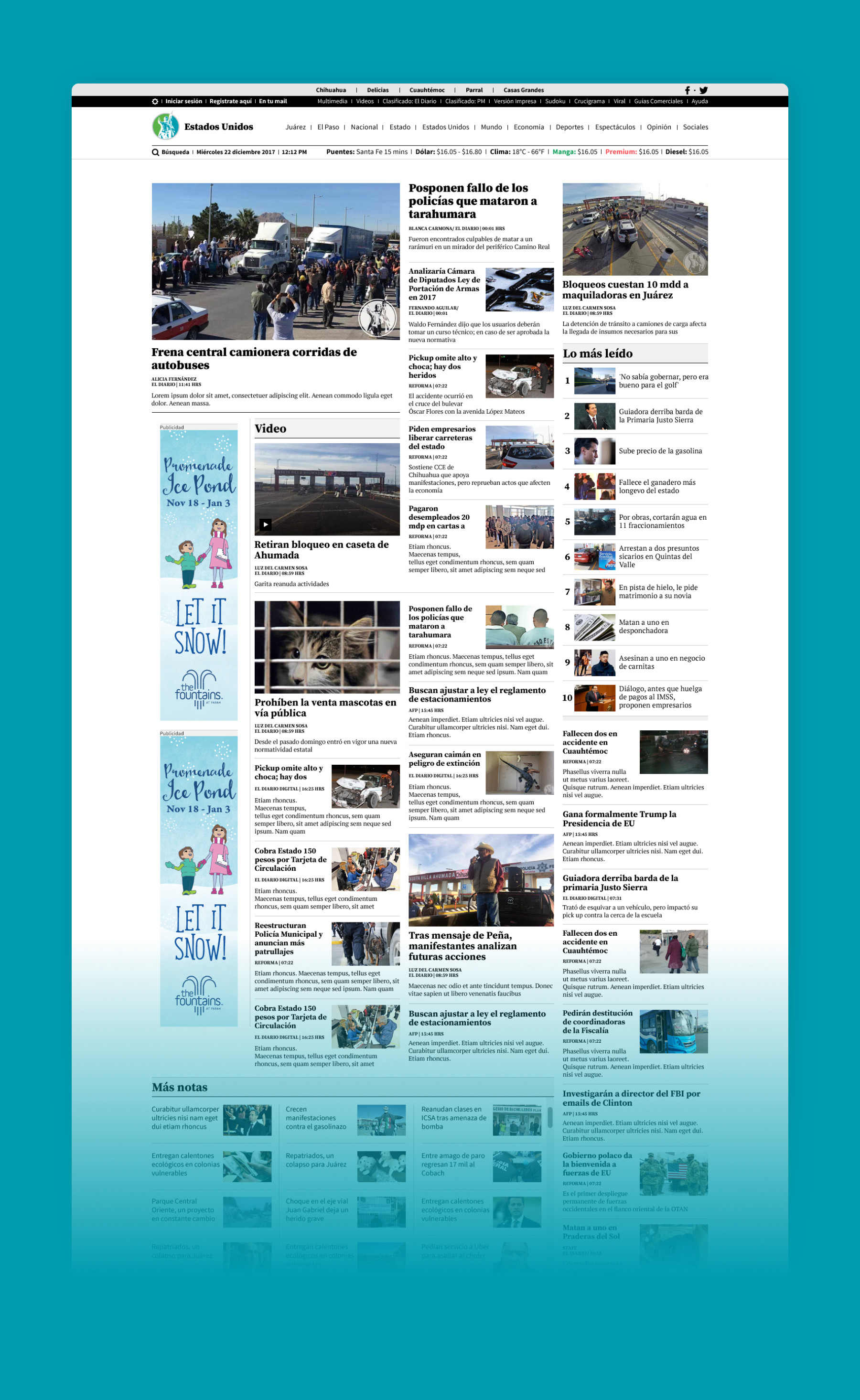
Typography & color
The overall style that was decided on was clean, simple, and black and white. The brand green color would be used minimally for accent buttons and other elements.
Typography played a huge role in my design. I remember I tested many headline and paragraph combinations. Two typographies were always the desired outcome. Merriweather and Roboto made an excellent combo, easy to read, and clean and precise.

The design phase was completed and was ready to go into development when a different approach was taken.
I would have liked to advance to the testing phase and keep playing around with different layouts. It’s the most prominent news site in my home city, so seeing it live would have been amazing. Unfortunately, our team was dismantled before we got a chance to officially present our work.