Flight Ninja
UI design + CMS + web app
Client
Aviation School in Florida
Role
Lead designer. We were assigned to propose a redesign concept of the whole website.
Year
2020
Company
Binmatter
Our client was an Aviation School in Florida, more specifically, the teachers of this institution. The commission was for the design of a web app that would help educators track and schedule students’ learning.
They already had a system in place which they called "Flight Ninja"; this was designed poorly and the UI needed many improvements. They got in touch to request a more user-friendly design, but keeping the same name. They provided us with the logo and the access to their existing web app.
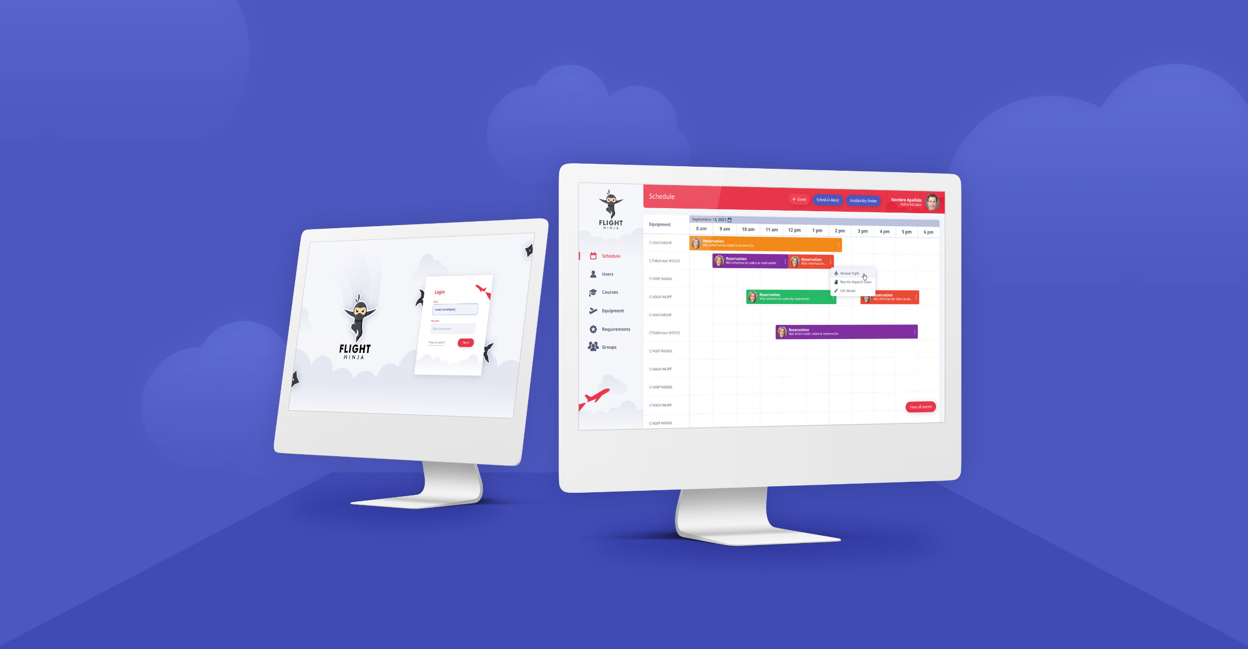
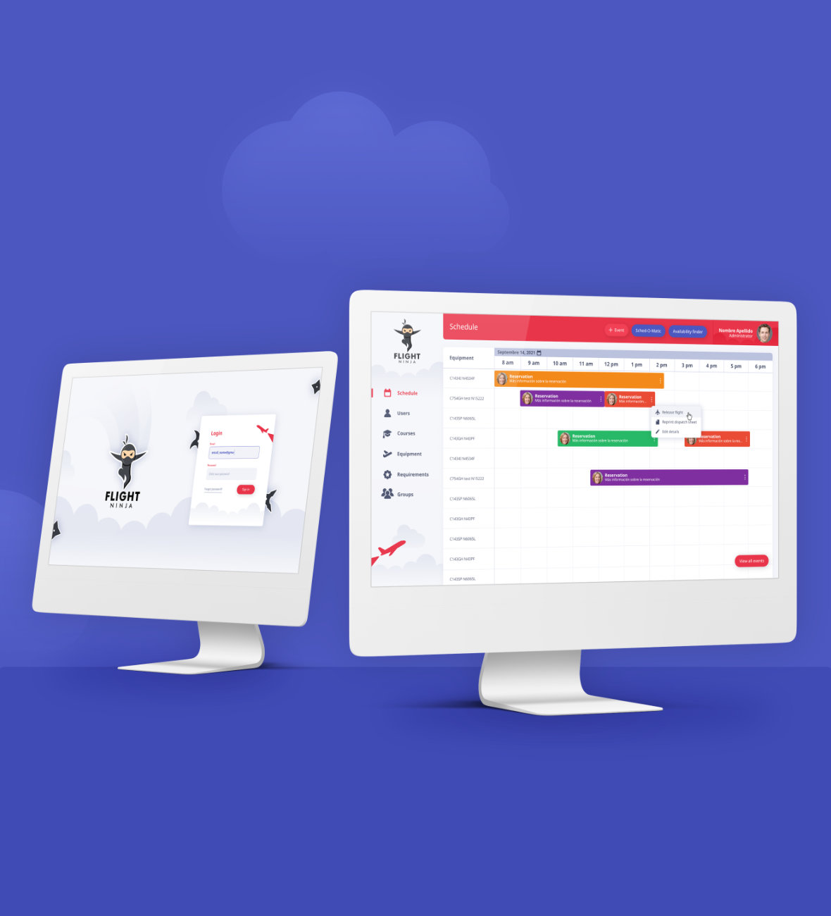
Flight Ninja is a web app designed for teachers that teach aviation. It was customized to include a wide variety of features, including scheduling both classes and flight practices, creating courses, grading lessons and many more requirements for students.
Problem
After having multiple meetings with the client, it was discovered that their existing CMS was outdated and non intuitive. This school needed something intricate that integrated all the specific requirements for a student to complete various lessons and test flights.
As I learned from these meetings, an aviation school takes hundreds of precautions and checkpoints in the teaching process. Teachers needed a platform where they could track a student's learning.
Besides the need to keep track of lesson plans, another essential part of the web app was a calendar section; this needed to take into account the availability of aircrafts, simulators, teachers, students and flying hours to arrange an optimal time for lessons.
Circling back to the main problem: the outdated CMS they were currently using. This needed a renovation along with some extra new features.
Goals
- Improve the UI with a whole new style.
- Visualize the main calendar, cross-referencing all teachers' scheduled lessons. This way, teachers can easily see what times are available for aviation equipment.
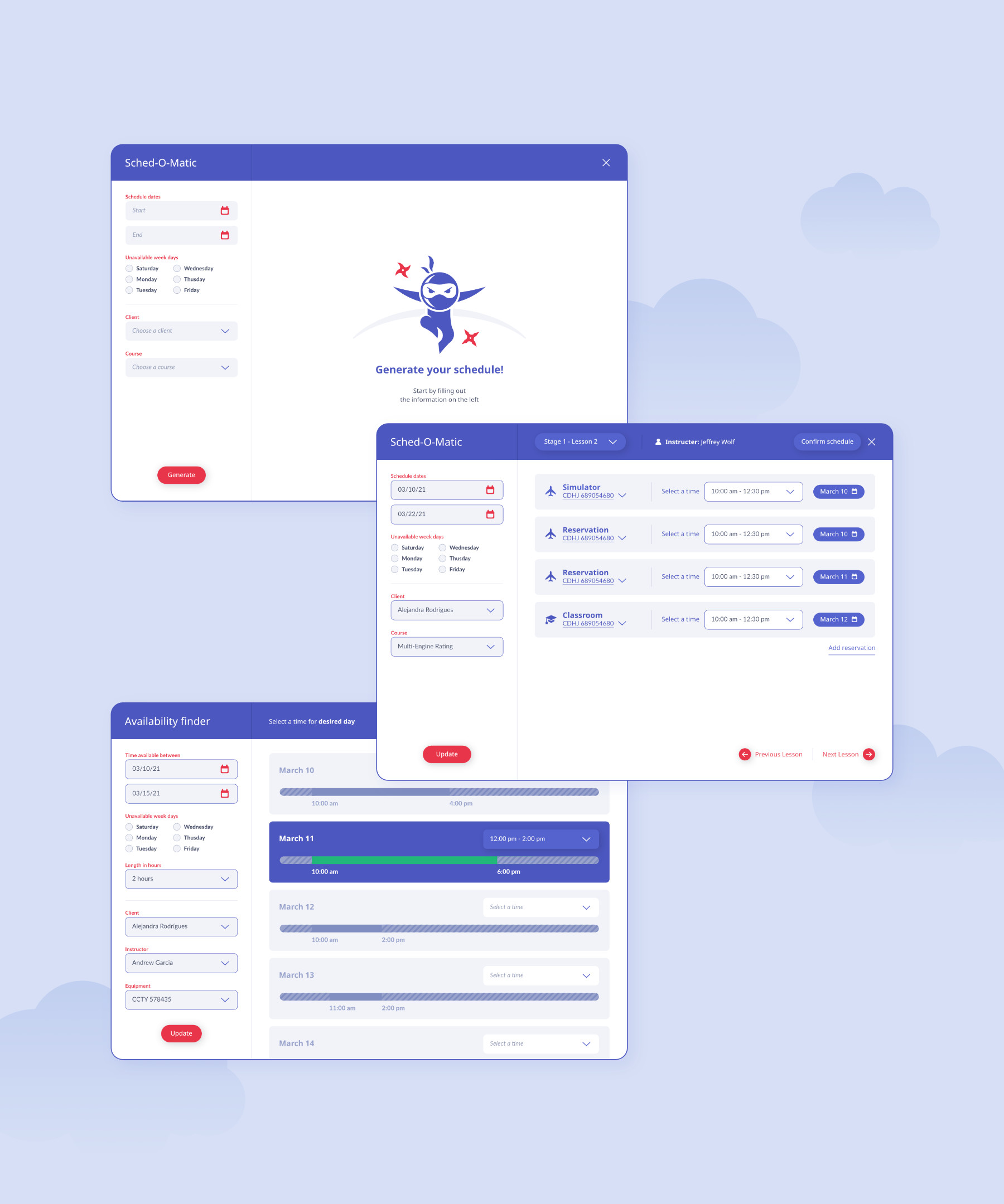
- Complementing the previous point, it was necessary to add an existing scheduling tool that they deemed with the name "Sched-o-matic"; this searched for availability using specific filters.
- It was necessary to incorporate a search function in order to find availability for arranging practice hours throughout the week.
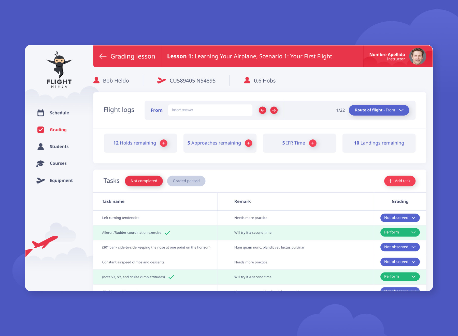
- A detailed lesson grading system that is made up of the following chain: courses > lessons > stages > individual tasks.
After having some meetings with the client, and watching a two hour explanation video of their current web app, I started exploring with wireframes and organizing my ideas. It was difficult to formulate my thoughts because it was a field foreign to me, and many of the questions that arose had to do with interconnecting between schedules and lessons.
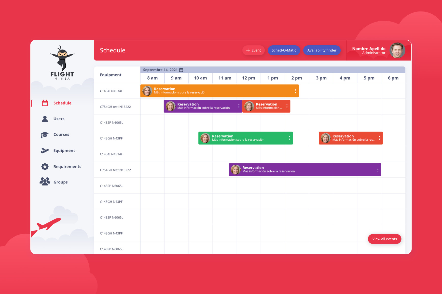
My biggest challenge was deciding the best method to integrate the calendar, finding a process to schedule flights, and establish a way for teachers to search for available airtime. I did this by making the calendar the default main section. Teachers have three different ways to create an event (meaning, to reserve airtime):
1. Directly with the “Create an Event” button; This creates a single event (meaning a single time frame for the flight); in this situation, the teacher knows the specific time period.
2. Through the “Sched-O-Matic”; a tool for scheduling concurrent lessons throughout long periods of time.
3. By using the “Availability Finder”; this tool would be used when a teacher was looking to browse for various options to book lesson
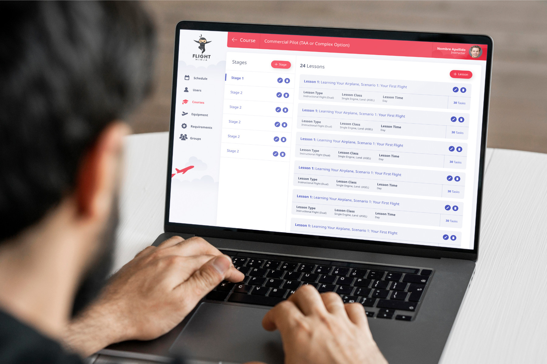
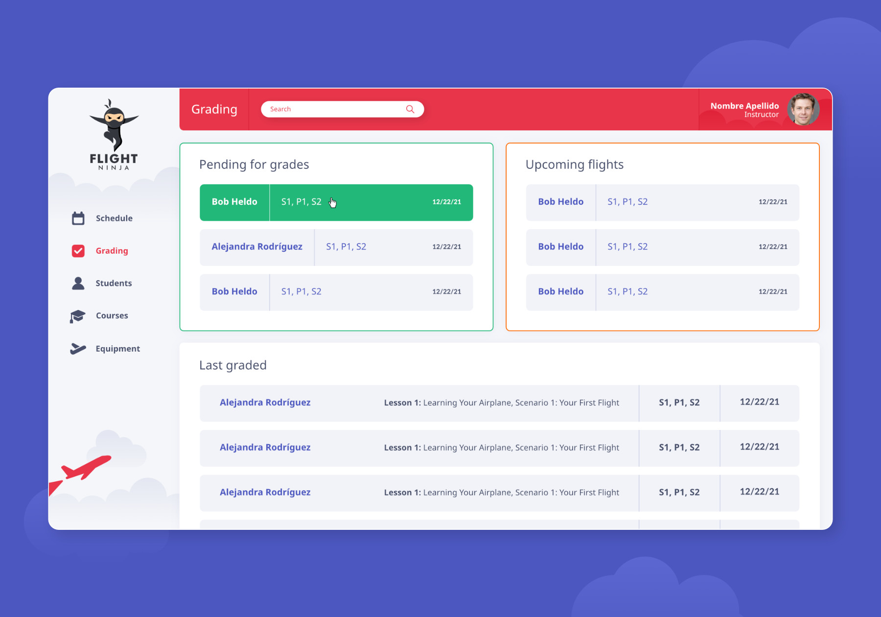
Another fundamental section is the measure to create courses and lessons. Each course consists of dozens of lessons, stages and individual tasks. Teachers needed a simple UI where they could navigate all courses. On par with courses, a grading system was implemented where individual tasks are shown in list form for faster grading. There aren’t many outcomes possible for these tasks, as it’s either a pass or fail. This made it simpler to add a drop-down menu with the limited options.
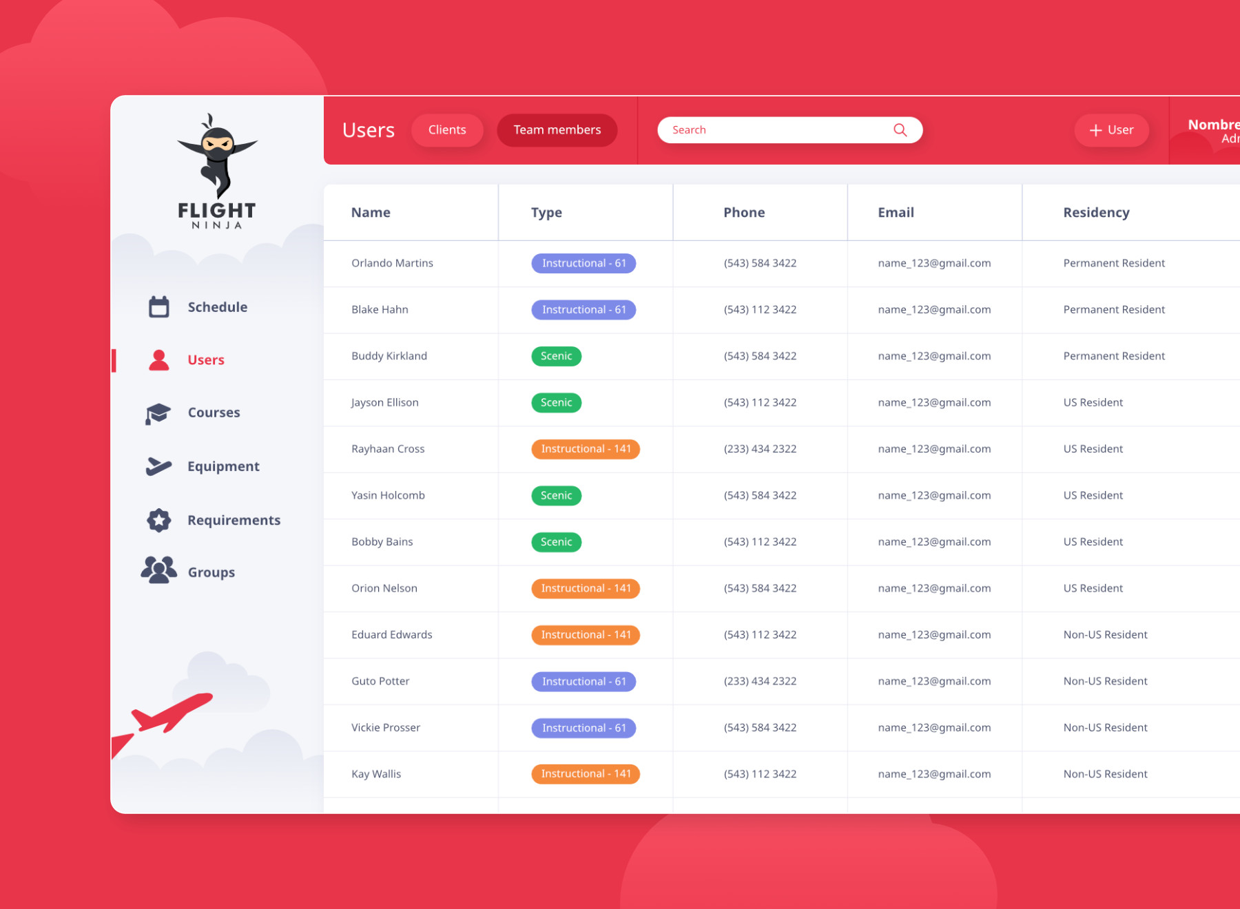
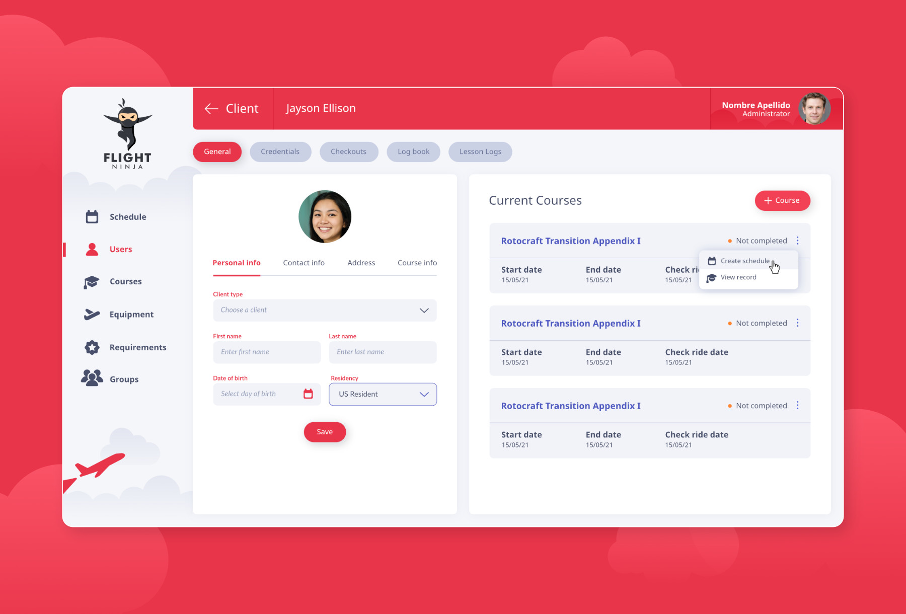
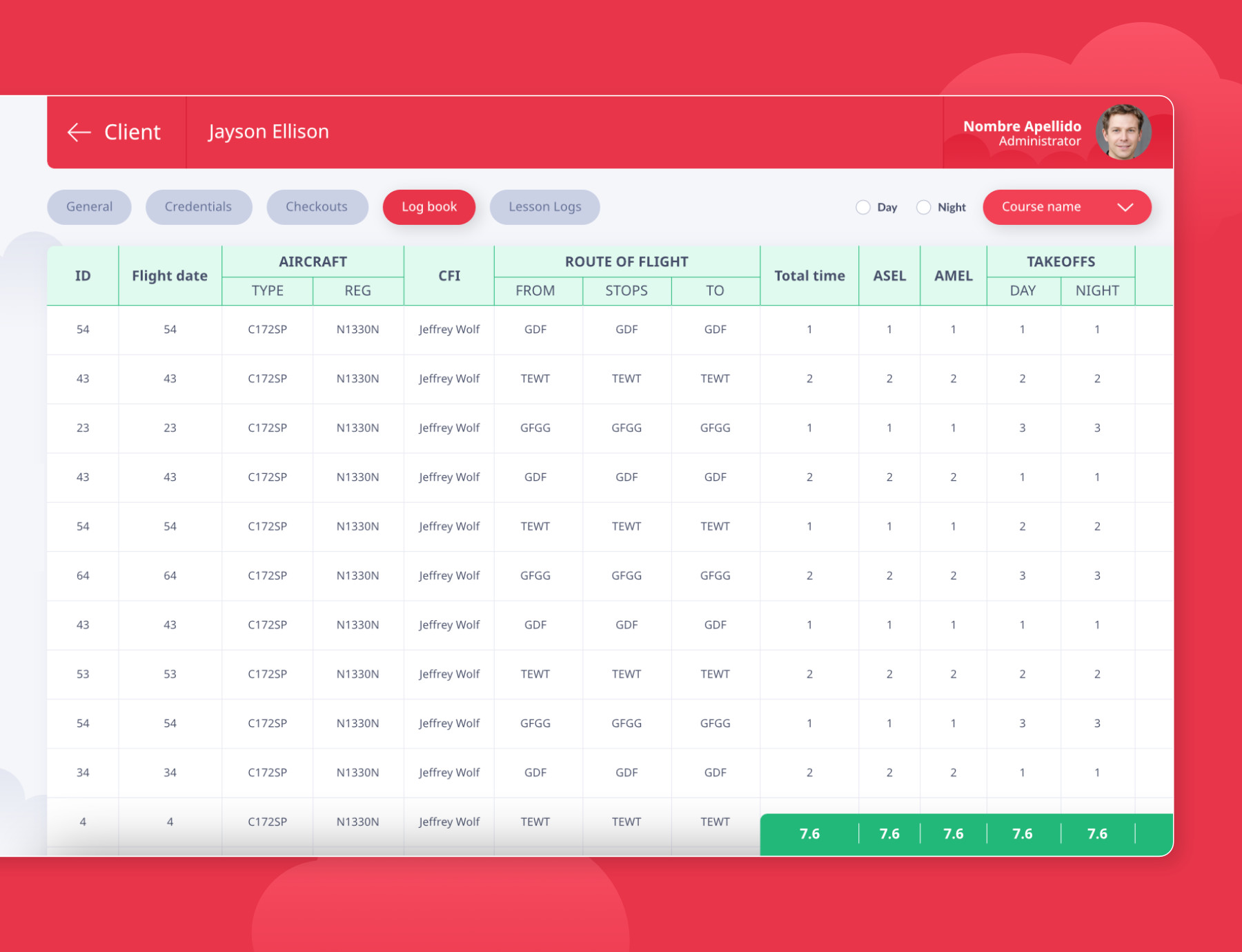
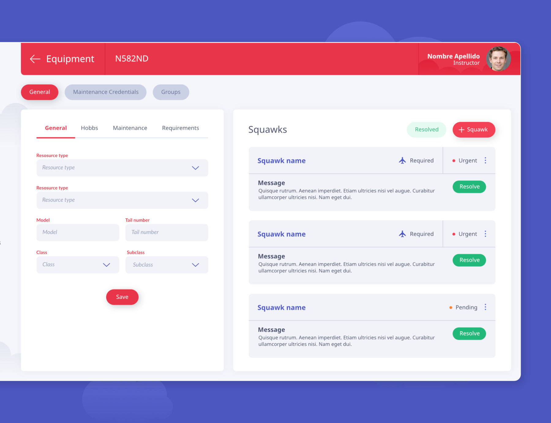
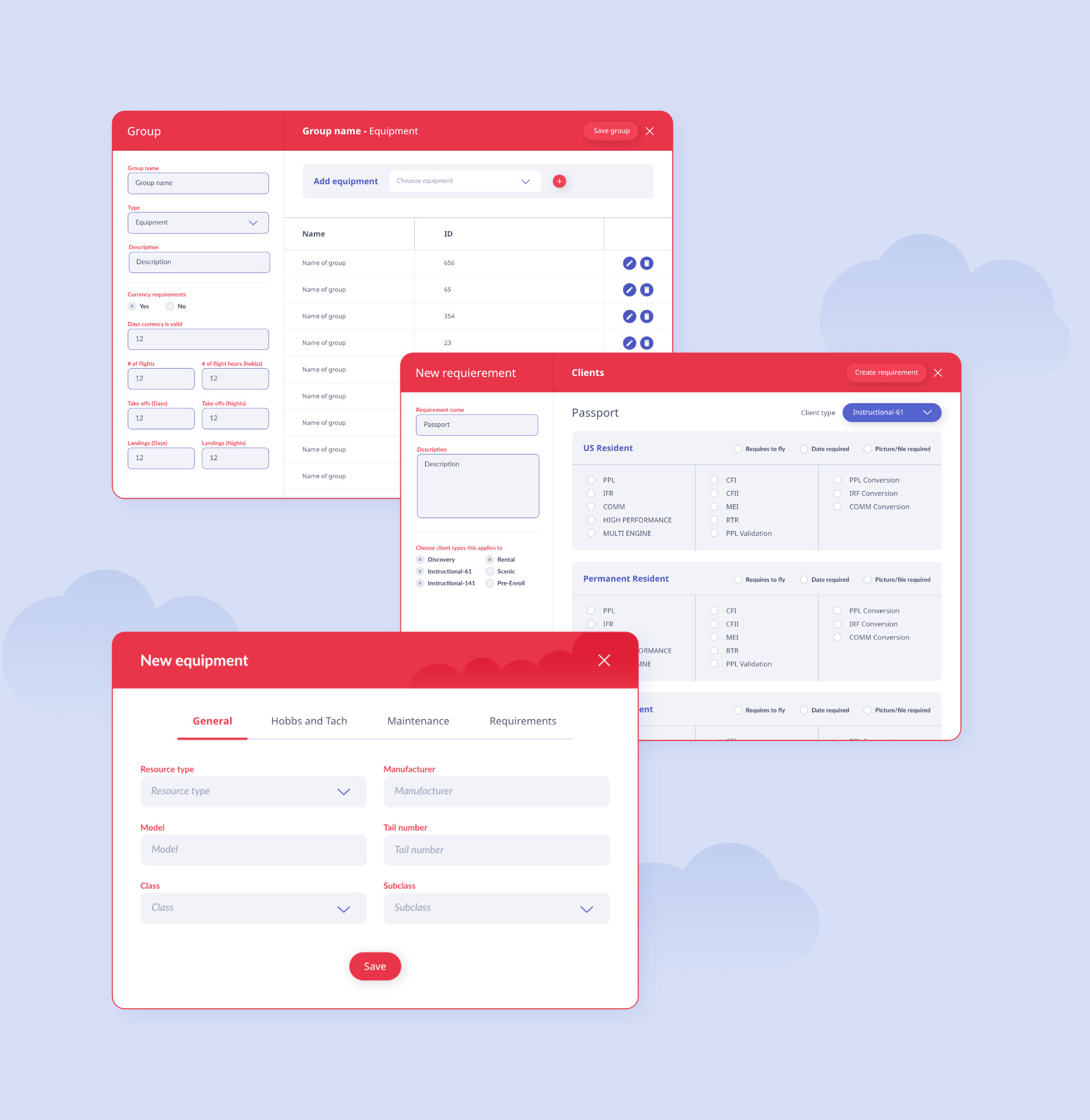
For the rest of the screens, I followed the same design style and kept all information organized in tables. The individual student’s profile UI is a bit different; I decided to organize the material into tabs to make it easier for teachers to navigate.
I would definitely want more time with the client and to test various prototypes. Because of time constraints, we didn't have the time to do in-depth research. Designing more options for the calendar and lesson plans would be ideal in exploring more practical ways to show information.