Input
Visual identity + UI design + logo design + CRM + web design

Client
Binmatter. Internal project set to be released for sale as a product in Mexico.
Role
Lead designer. I was the sole designer for this project, with the task to design a brand that would encapsulate various products under the name.
Year
2018 - 2022
Company
Binmatter
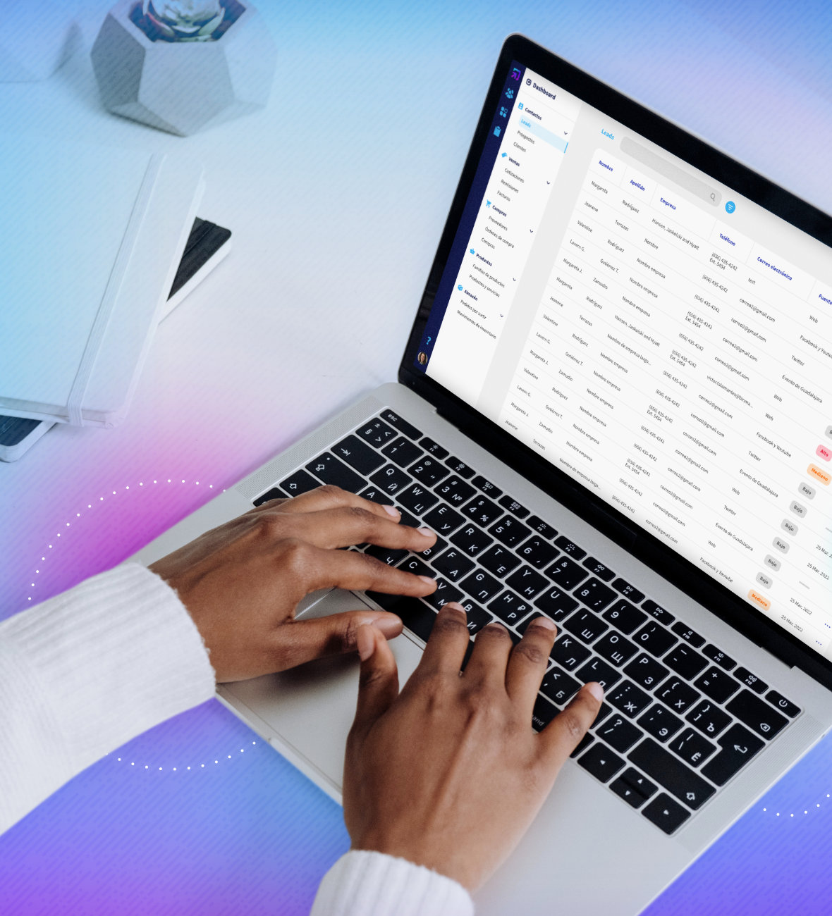
Input is a specialized CRM created for the easy management of businesses. Its made to cover a wide range of fields, including the administration of five main fields: contacts, sales, purchases, products and inventory.
This was an internal project set to be released for sale as a product in Mexico. The target users were meant to be different types of businesses who seek a content managing tool. This CRM helps companies in a wide variety of information, including: leads, contacts, sales, inventory and much more.
Aside from the main web app, the Input brand consists of additional systems that integrate into a business. This includes a POS software, a lead manager app and other features that are in the works.
Problem
Businesses need an essential tool where they can manage all aspects of their operations. The lack of organization can cause companies to miss out on potential clients by not keeping track of leads, or lose a sale if an invoice isn’t sent on time.
One of the larger problems is finding a smooth process to generate digital invoices (CFDIs) from existing quotes and receipts. It was essential for this to be a fundamental part to make the invoice process as straightforward as possible.
Goals
- Design a CRM that is practical and easy to use. We sought out to develop a better administrative alternative, separating data into five main categories.
- Construct a simple table format to visualize large amounts of data.
- Integrate a universal search bar to facilitate easy access to information.
- Make a straightforward sales process that starts with a quote and concludes with a sale or a delivery.
- Supply useful information in the form of a customizable dashboard.
Design process
The initial idea was to create something easily associated with a CMS; the goal was to make a business-friendly logo that would convey the brand's commitment to provide administrative tools.
For this reason, I decided to incorporate recognizable elements, composing of an arrow and a square to create a straightforward icon representing a web input.
The colors were chosen to represent the various tasks Input can achieve; with a vibrant color palette, these cool tones work together to compose diverse illustrations and designs. Individual colors were picked to embody the distinct categories in which Input can be used.



Design process
Without a doubt, my biggest challenge understanding the core process of how businesses make a sale. For big companies, it’s not as simple as receiving money and providing a product; it involves many user scenarios. To rephrase, our CRM’s main objective would be to adapt to all user encounters, no matter how big or small.
I set out to look at main competitors and saturate myself with data visualization. I started with two main components: the main side menu and the primary table layout where most information would be displayed. Some features include customization of columns, a wide variety of filters and extra options.
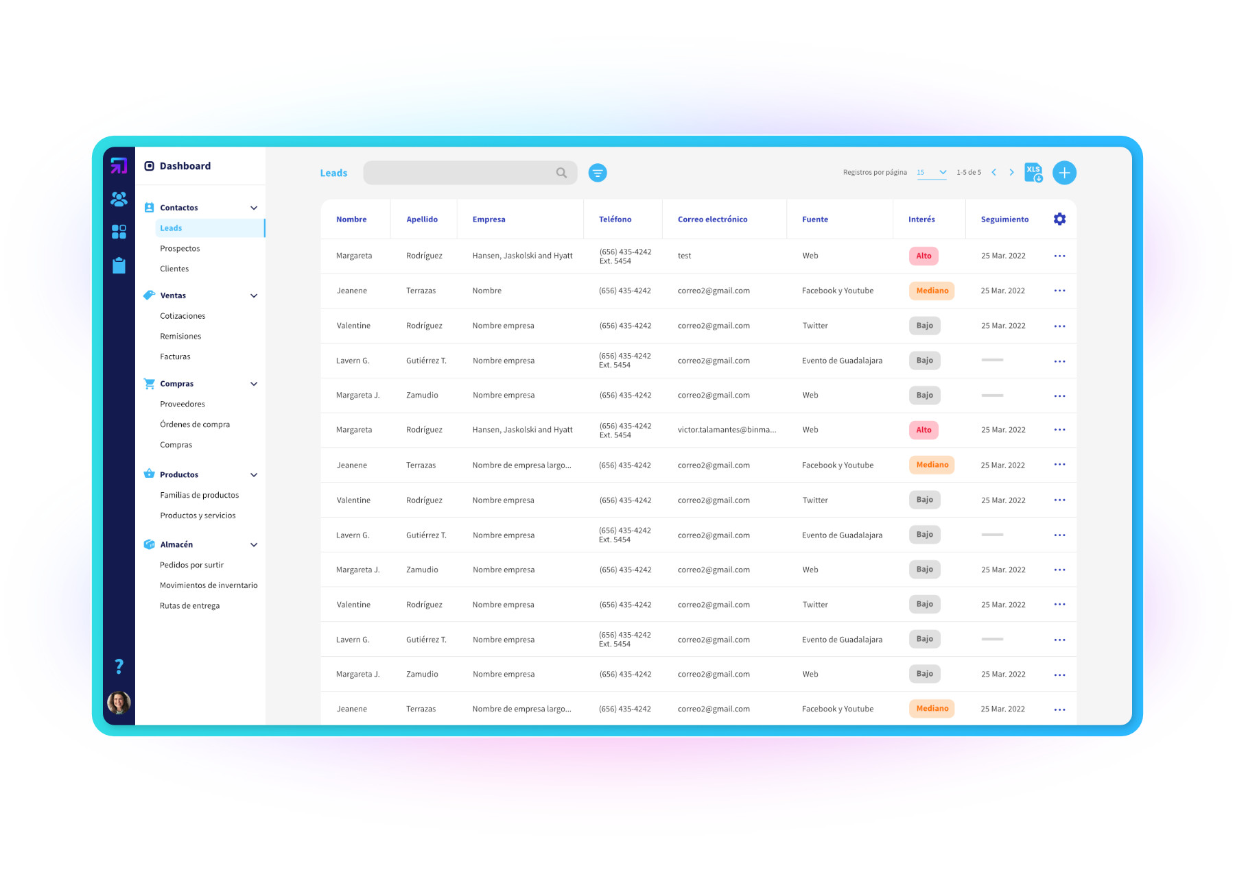
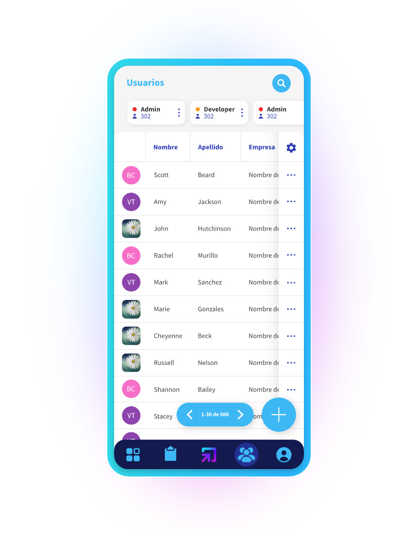
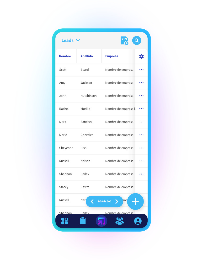
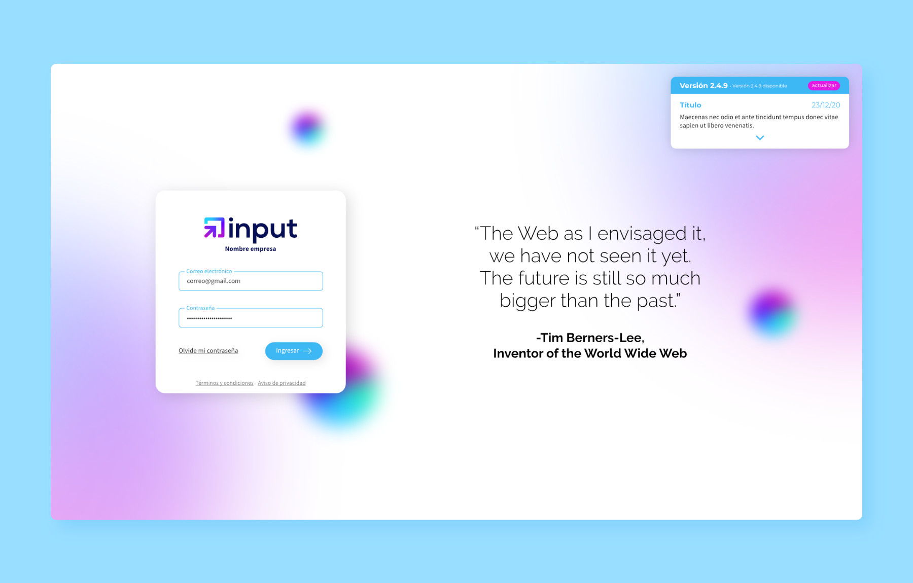
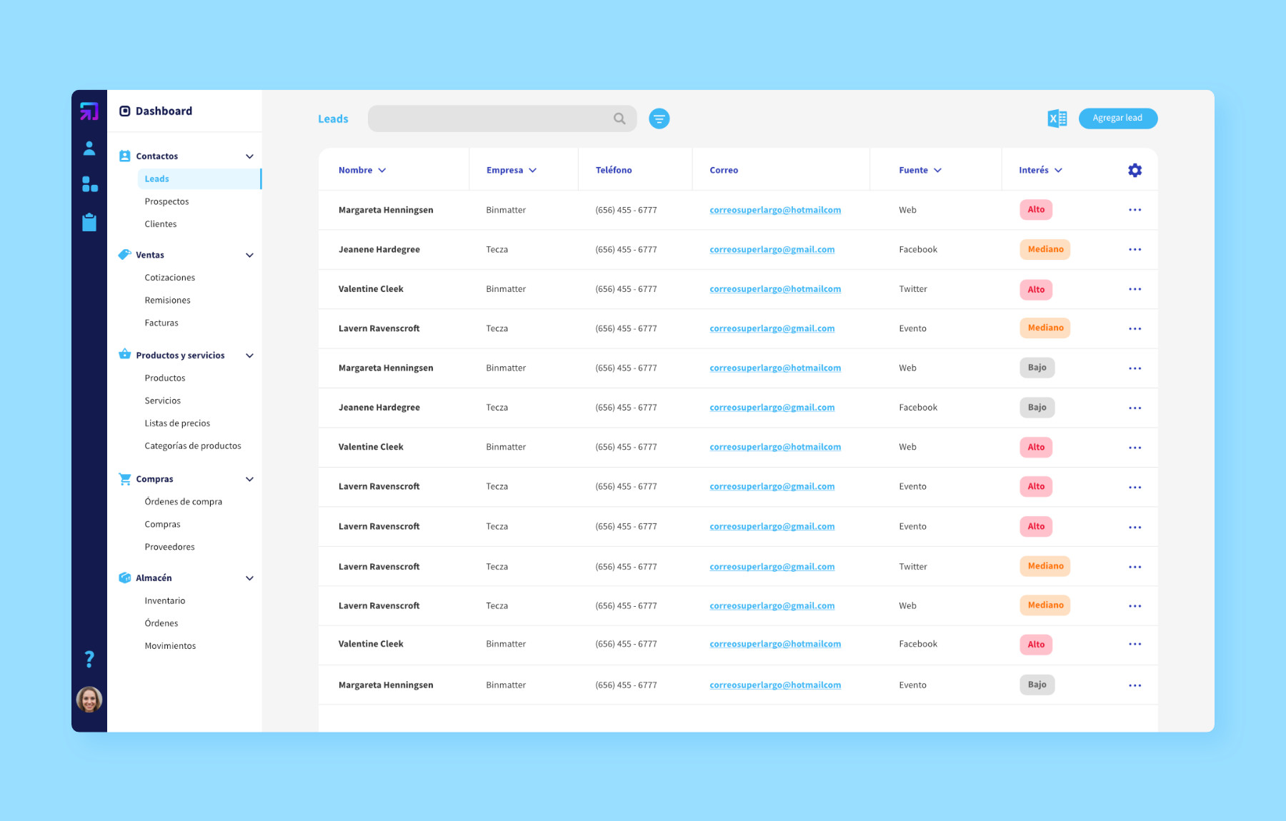
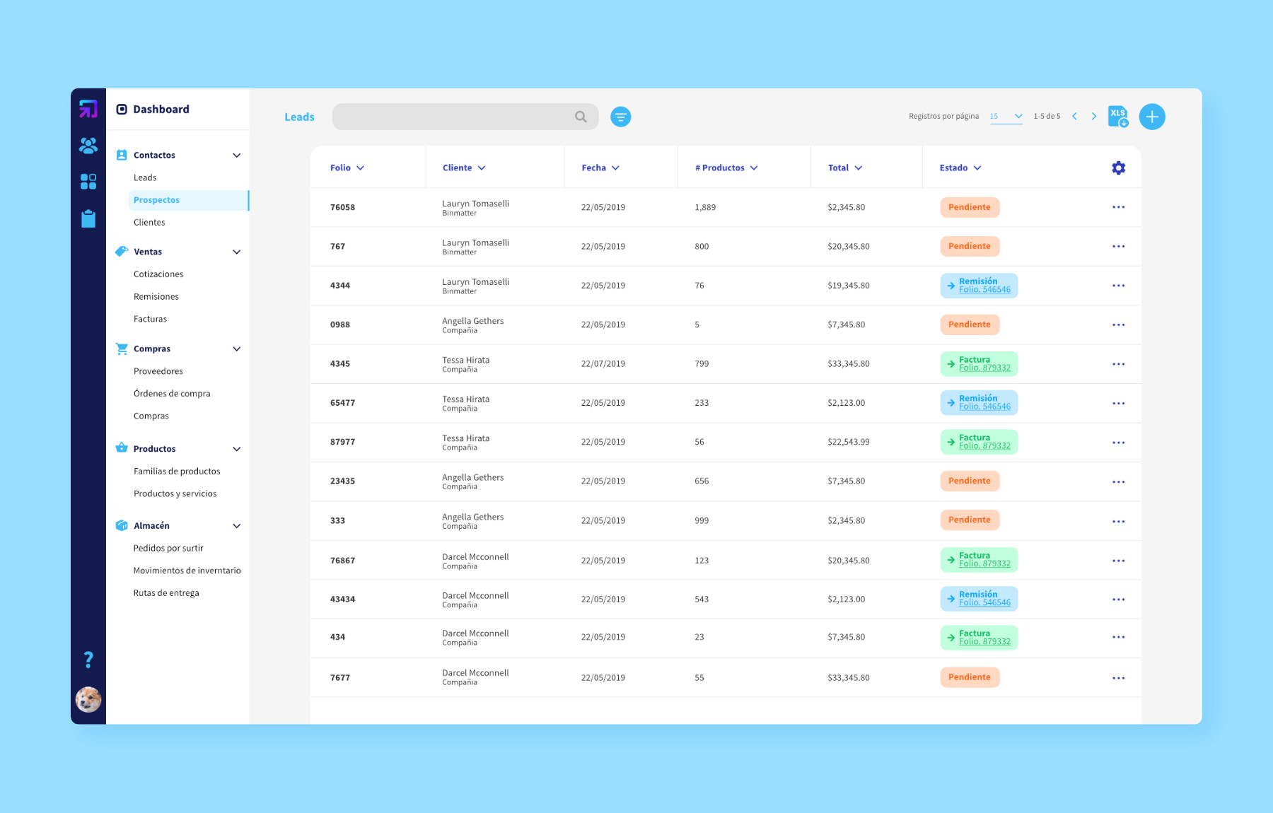
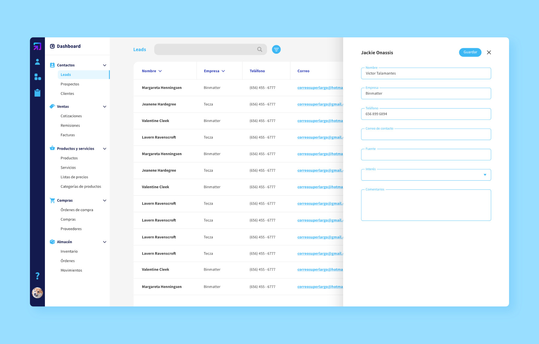
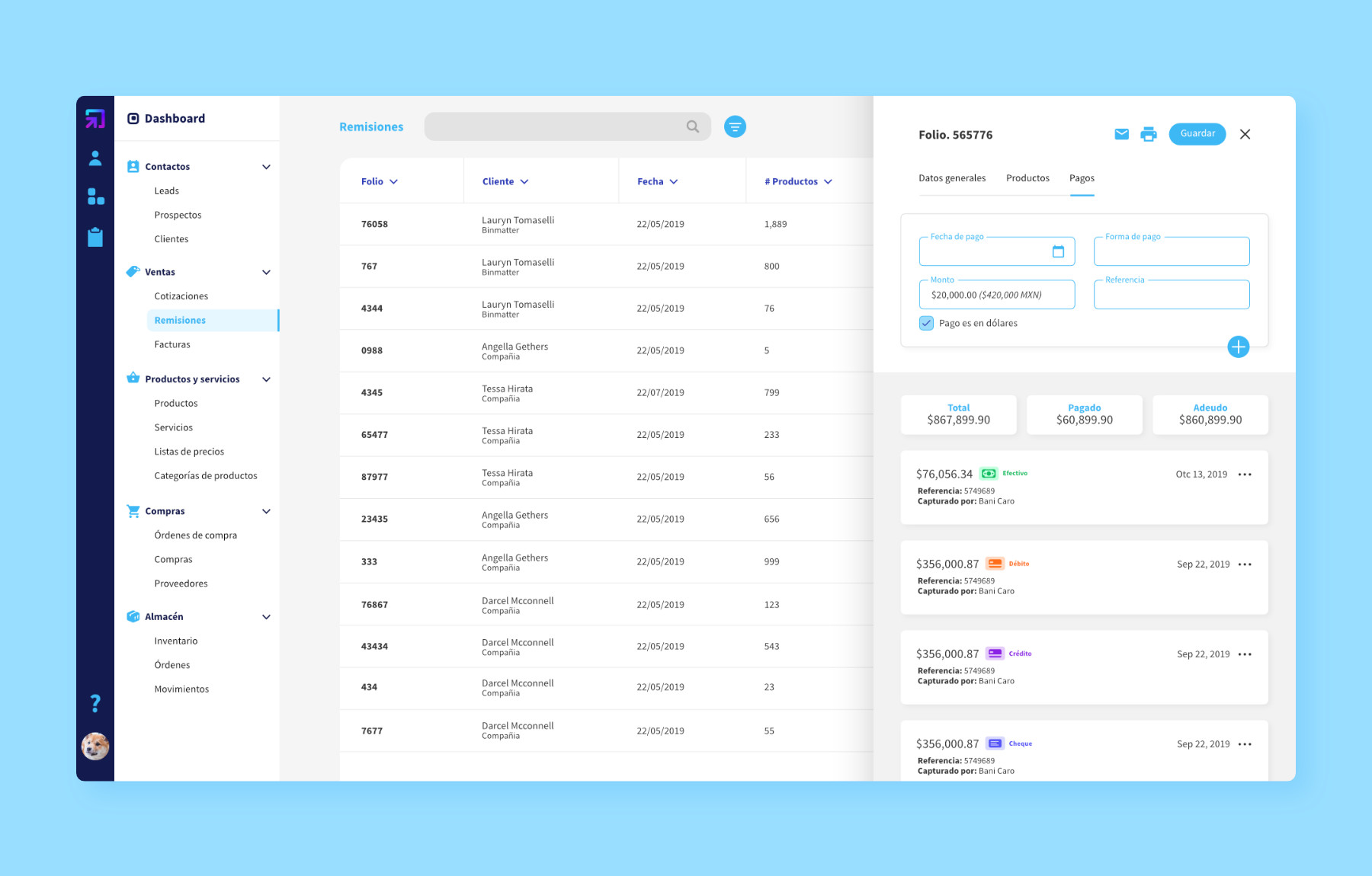
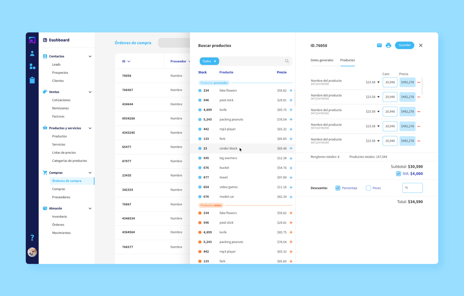
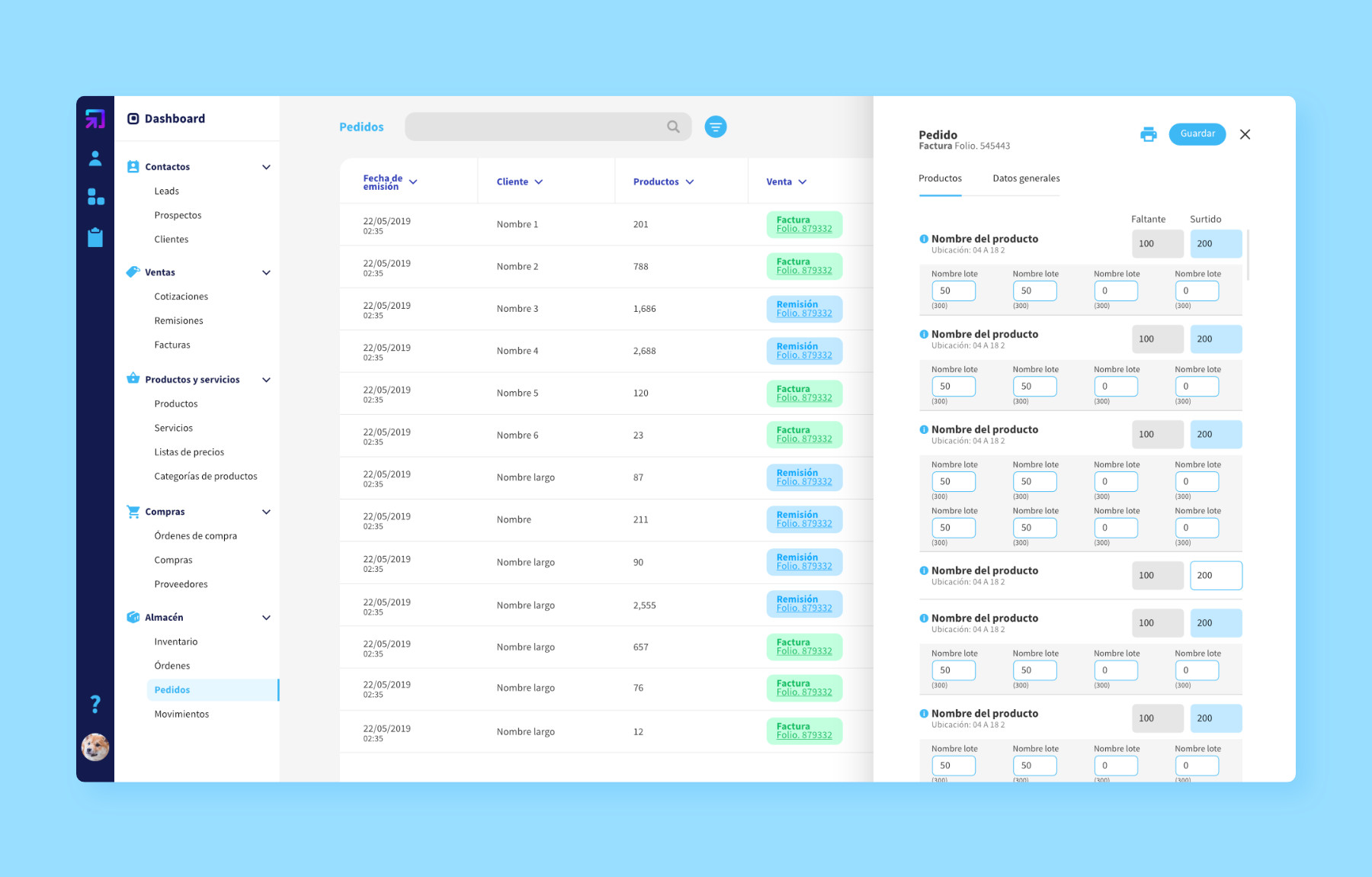
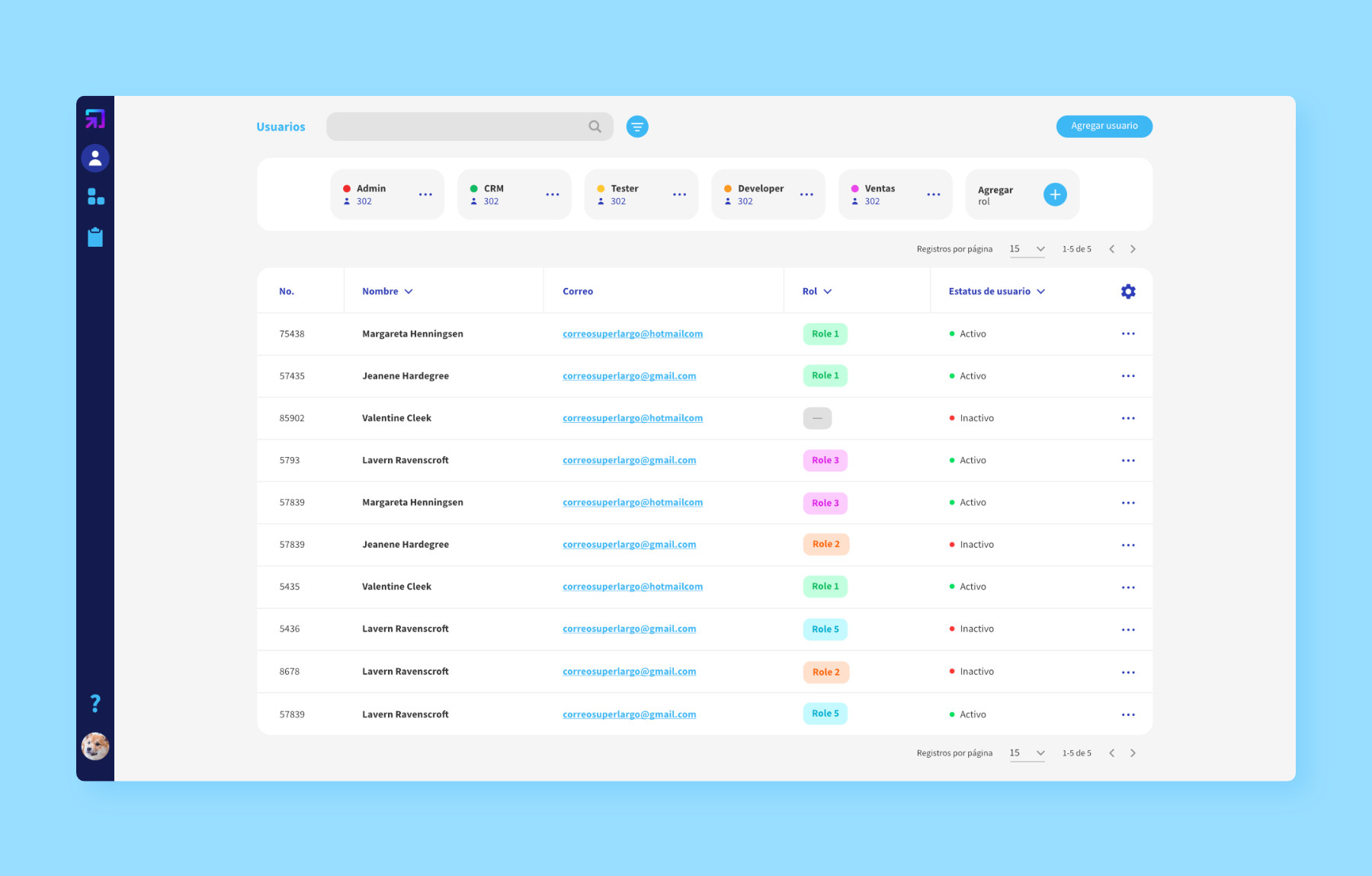
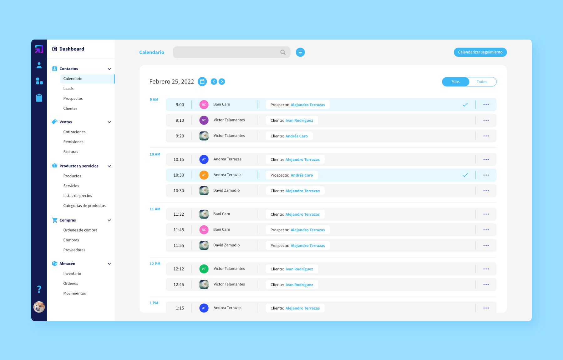
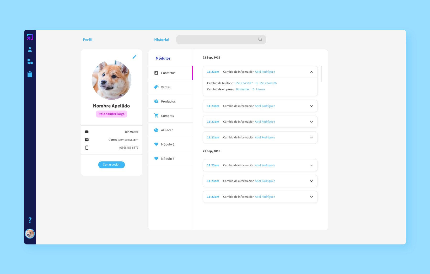
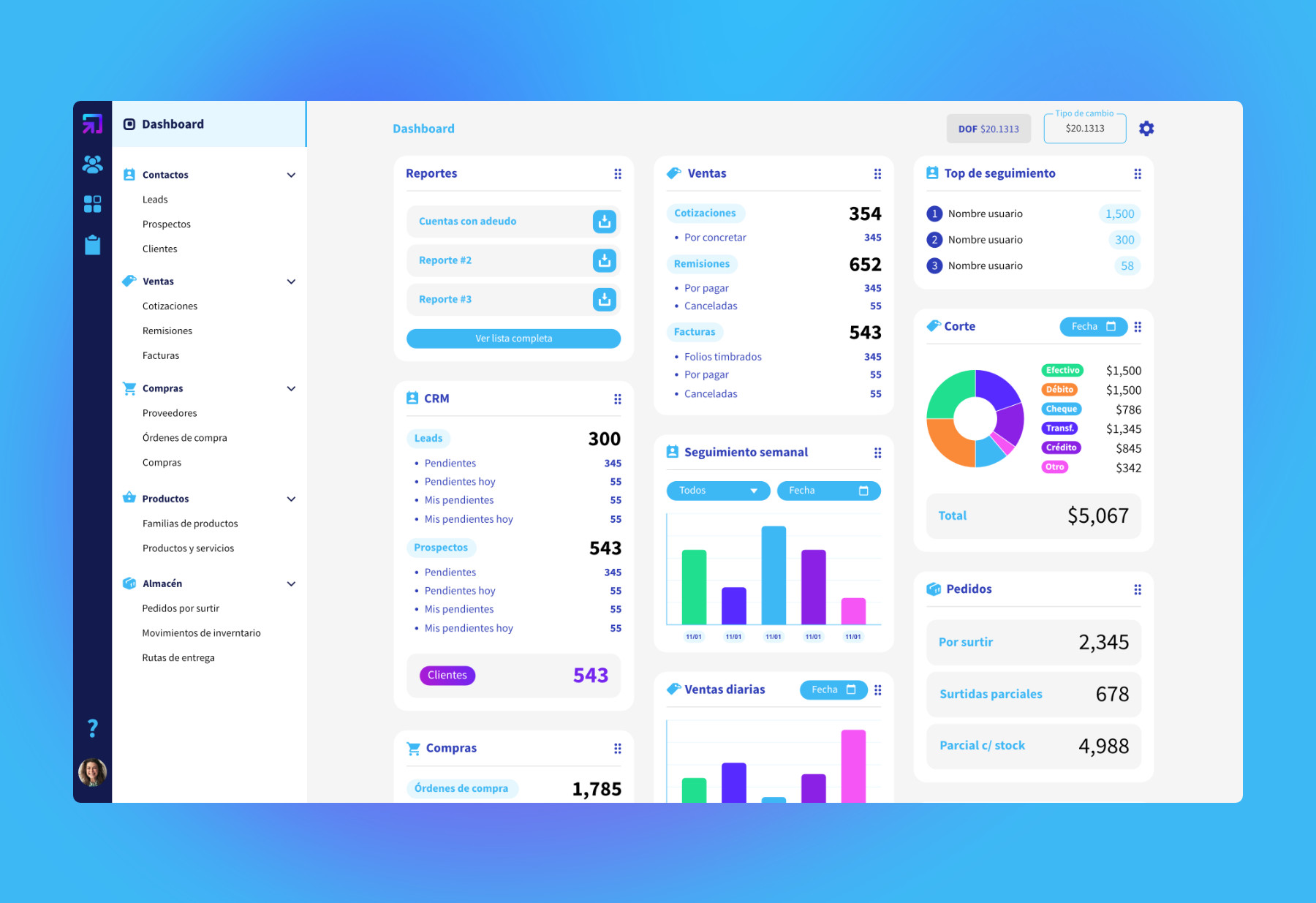
My main purpose with the dashboard was to show the most important information right when the user logs in. Data is shown in card form, each one displaying information from the five main sections: contacts, sales, purchases, products and inventory.
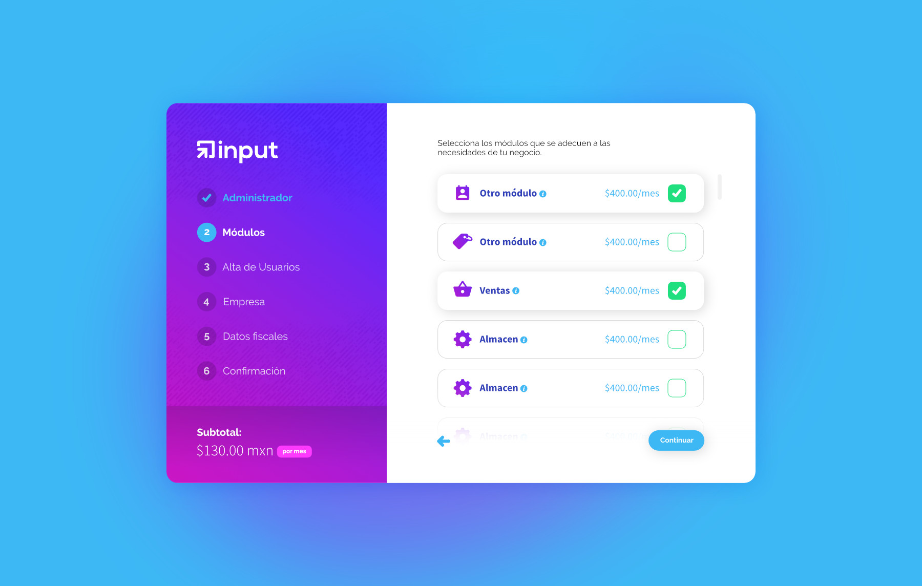
A setup wizard is the first iteration of how users would set up the web app. It’s a step by step process that guides the user through the fundamentals of setup, including the method of payment. This was thought out to be on module basis, plus a monthly fee.
Problem
This will be a future problem for when the product launches; a means of educating users on the benefits of Input, and how it can aid their business. Input would need to be achieved for users to sign up on a free trial basis, then be charged a monthly fee.
Solution
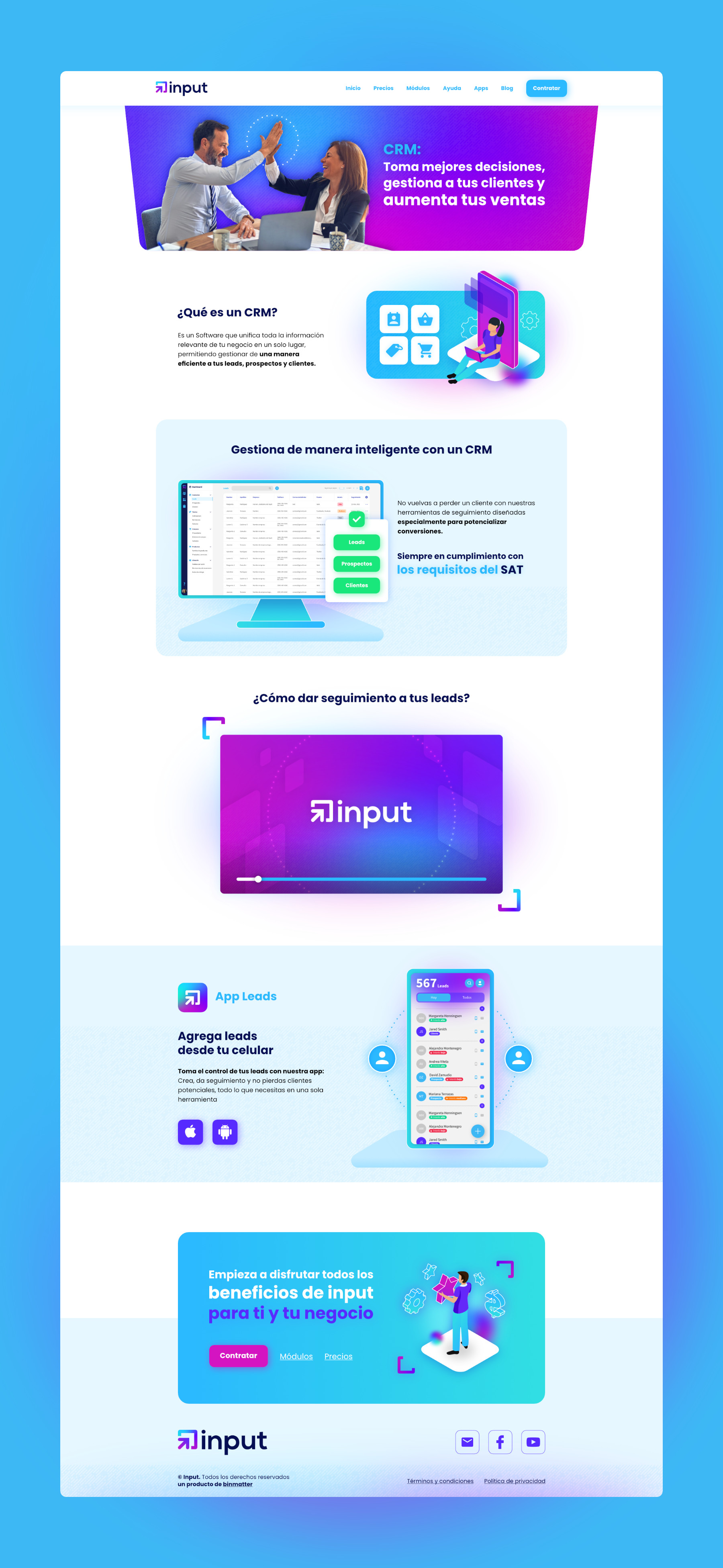
Releasing a beta version to users who sign up would be a component of my solution. This would build confidence in the public and provide testimonials showcasing growth. Going back to the website, information about prominent features are displayed on the landing page to grab attention quickly. A blog section was added to keep all updates in one place, and inform users of new features public.

For social media, I designed initial posts and general elements to build up a brand board for future works. The emphasis is on communicating all the useful ways Input can be used, with additional creative tips on tech.
