RLTCare
Senior designer
Visual identity, web design, design system, documentation
2025

Project overview
Novartis is a global pharmaceutical company focused on developing innovative medicines. RLTCare is a digital platform created to provide healthcare professionals with resources, tools and support for radioligand therapy.
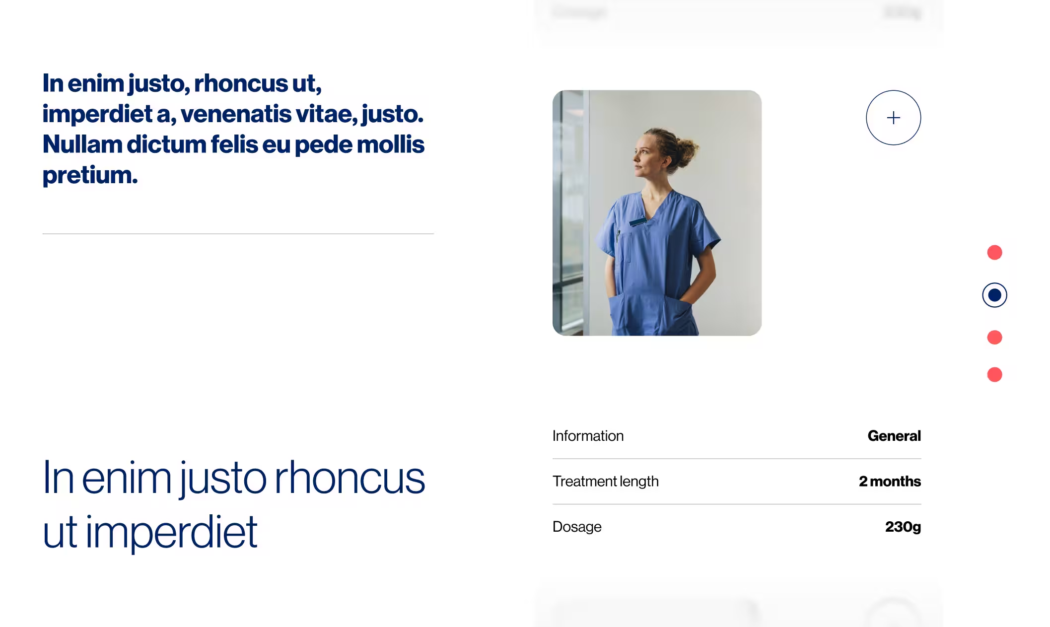
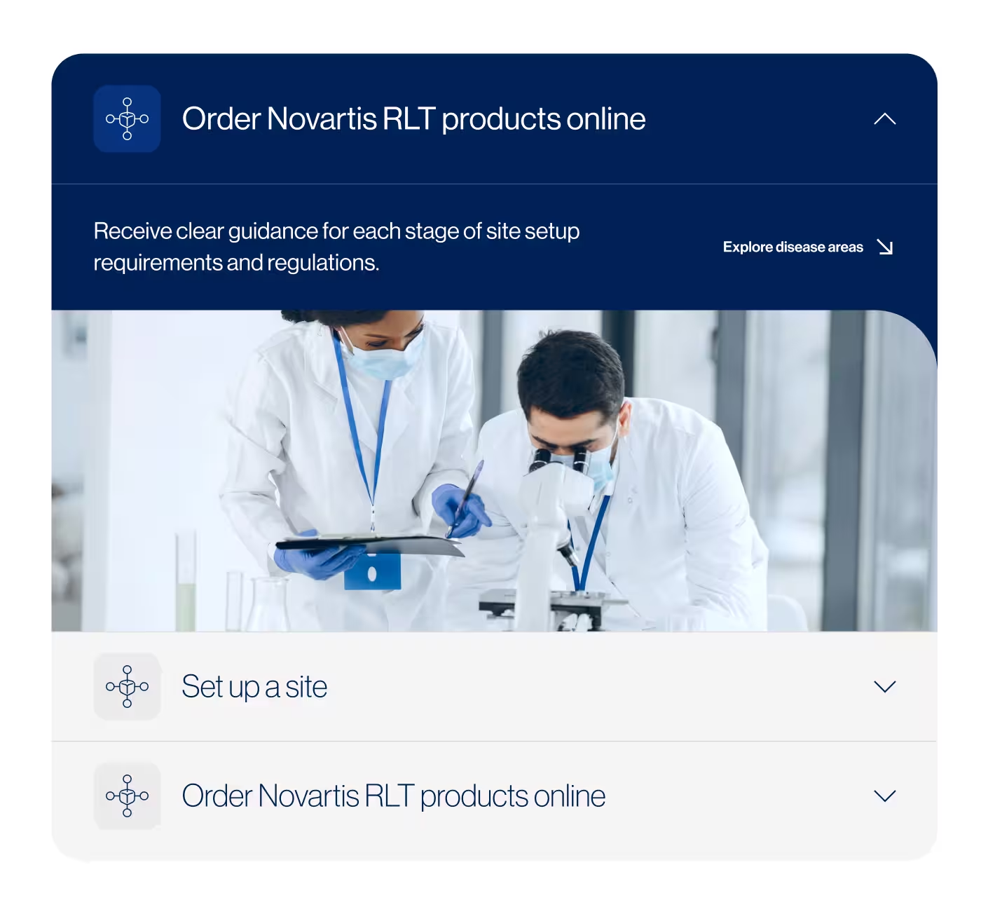
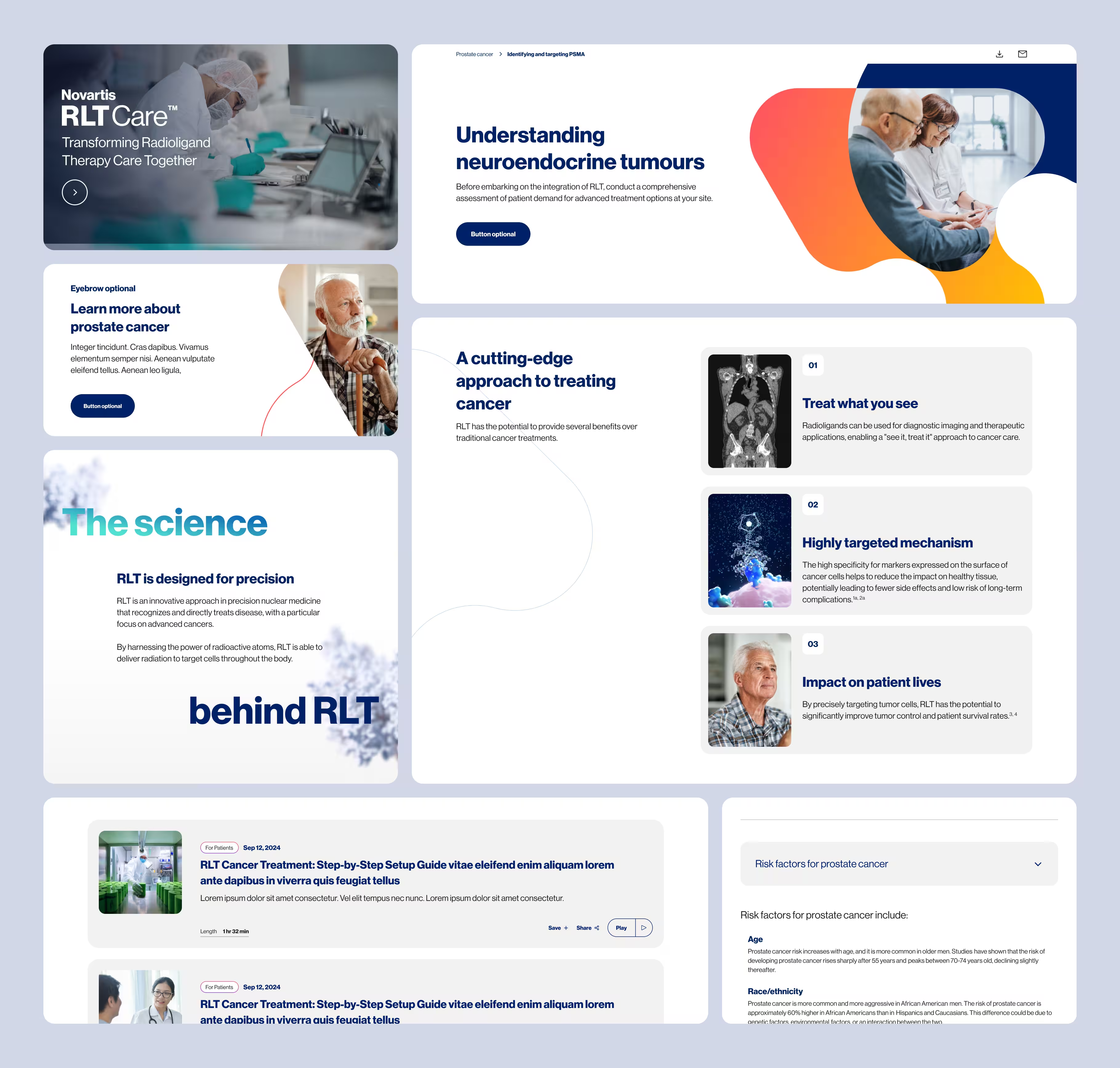
My main focus was expanding the RLTCare website and building a more flexible design system that could grow alongside it. I designed new UI components and page templates that could be reused to create RLTCare hubs for different markets, while maintaining a consistent visual language and user experience.
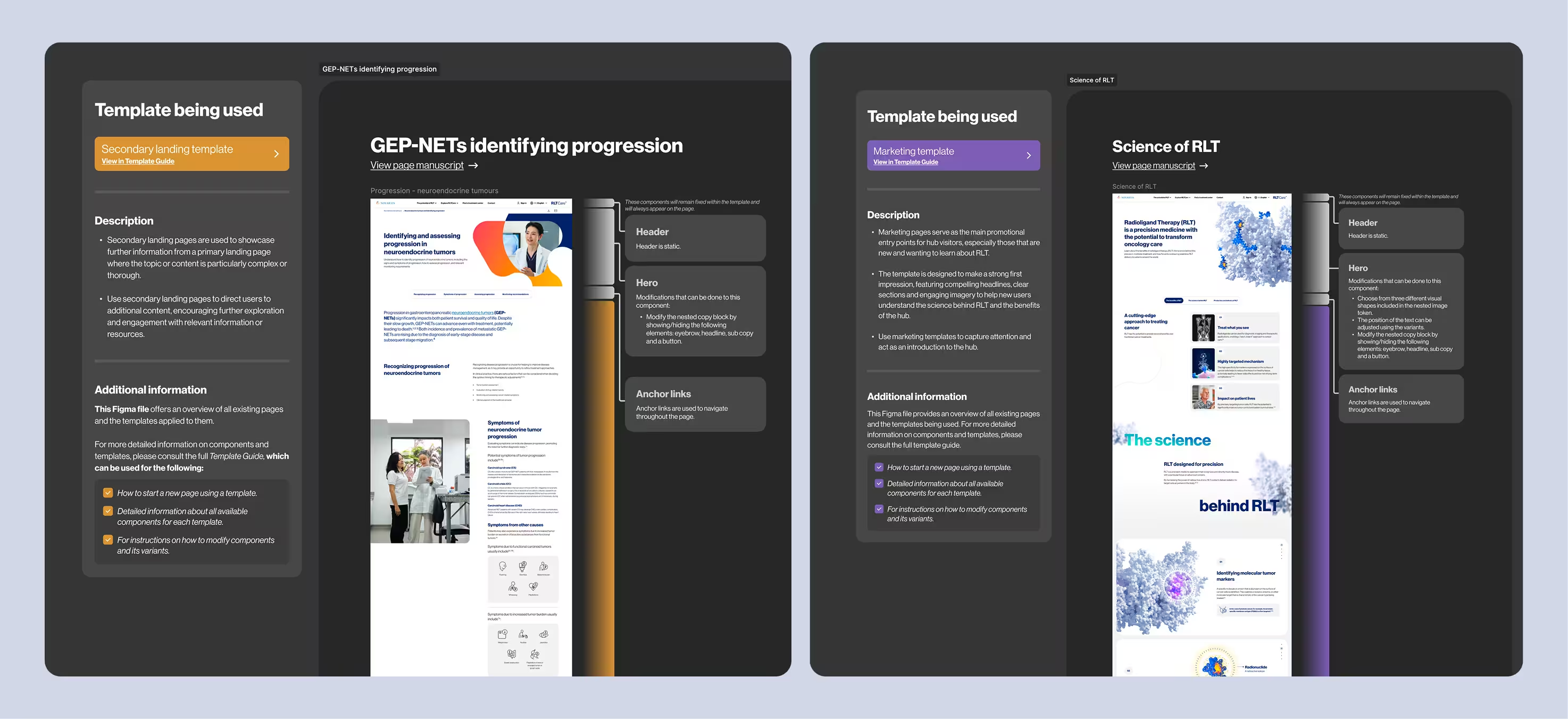
To make the system easy for other teams to use, I created detailed Figma documentation explaining how to build new pages using the templates and components while keeping the experience consistent across markets.
Problem
RLTCare needed to expand into an international hub where healthcare professionals and patients could learn about radioligand therapy, prostate cancer and RLT products, while also guiding healthcare facilities through the process of establishing their own RLT centers.
The challenge was organizing this large amount of specialized content into a clear and easy-to-navigate experience. The site also needed a flexible structure that could grow over time, with future sections dedicated to resources, events and news related to RLT.
Goals
- Create a clear and intuitive experience that organizes complex RLT, disease and treatment information in a way that is easy for healthcare professionals to navigate.
- Build a scalable design system and flexible page templates that could support new RLTCare hubs across different markets while maintaining visual consistency.
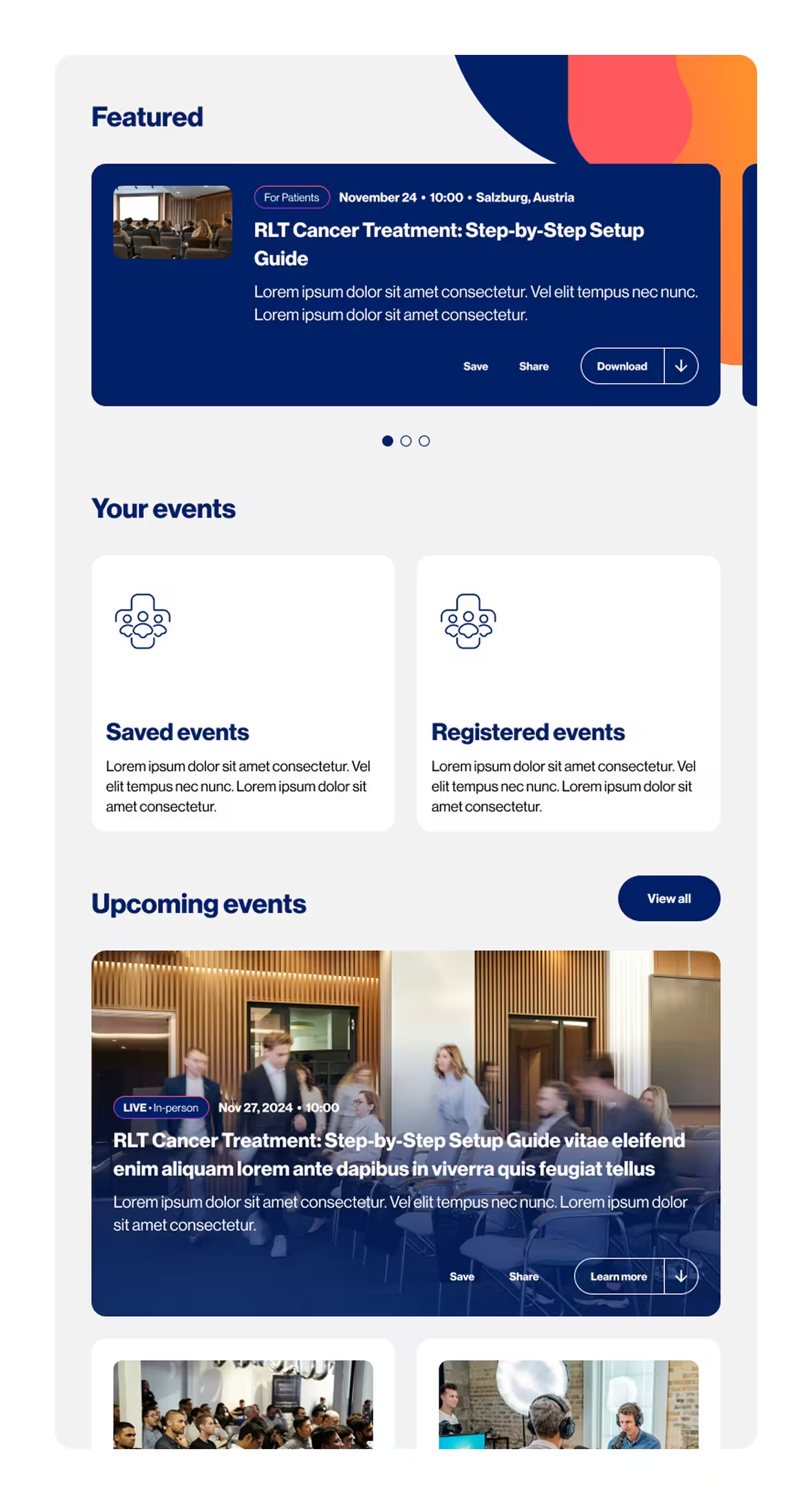
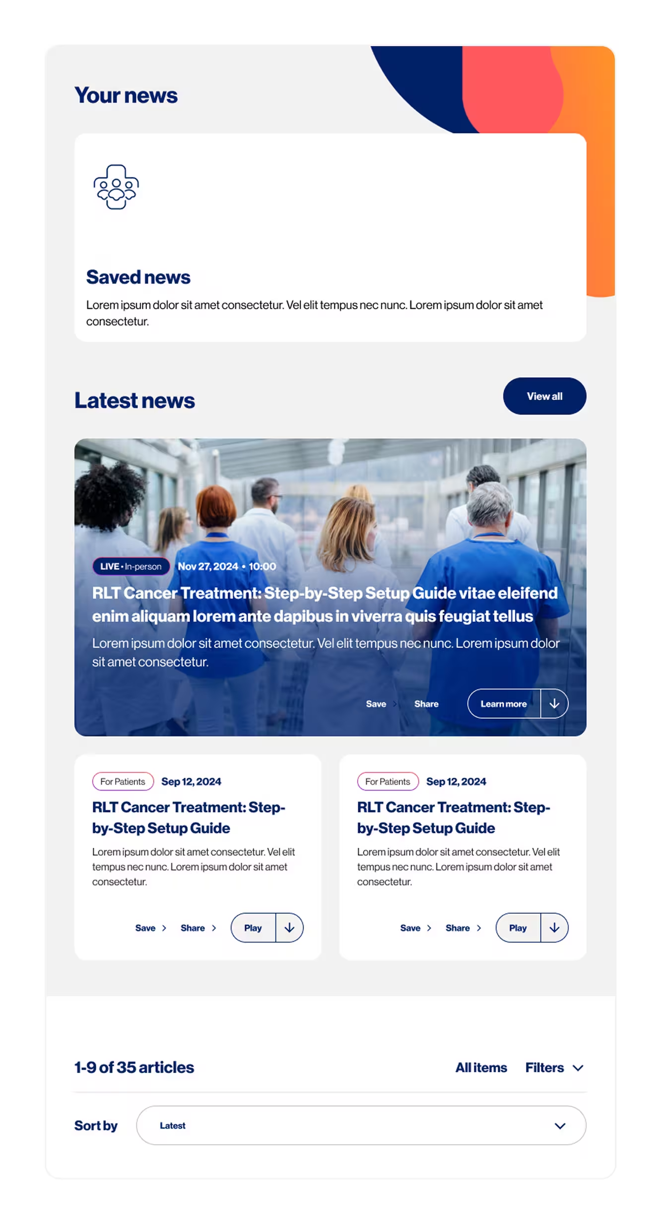
- Create a reusable framework that could grow with RLTCare, allowing teams to easily introduce new content such as resources, events and news.
Global archetype
RLT hub
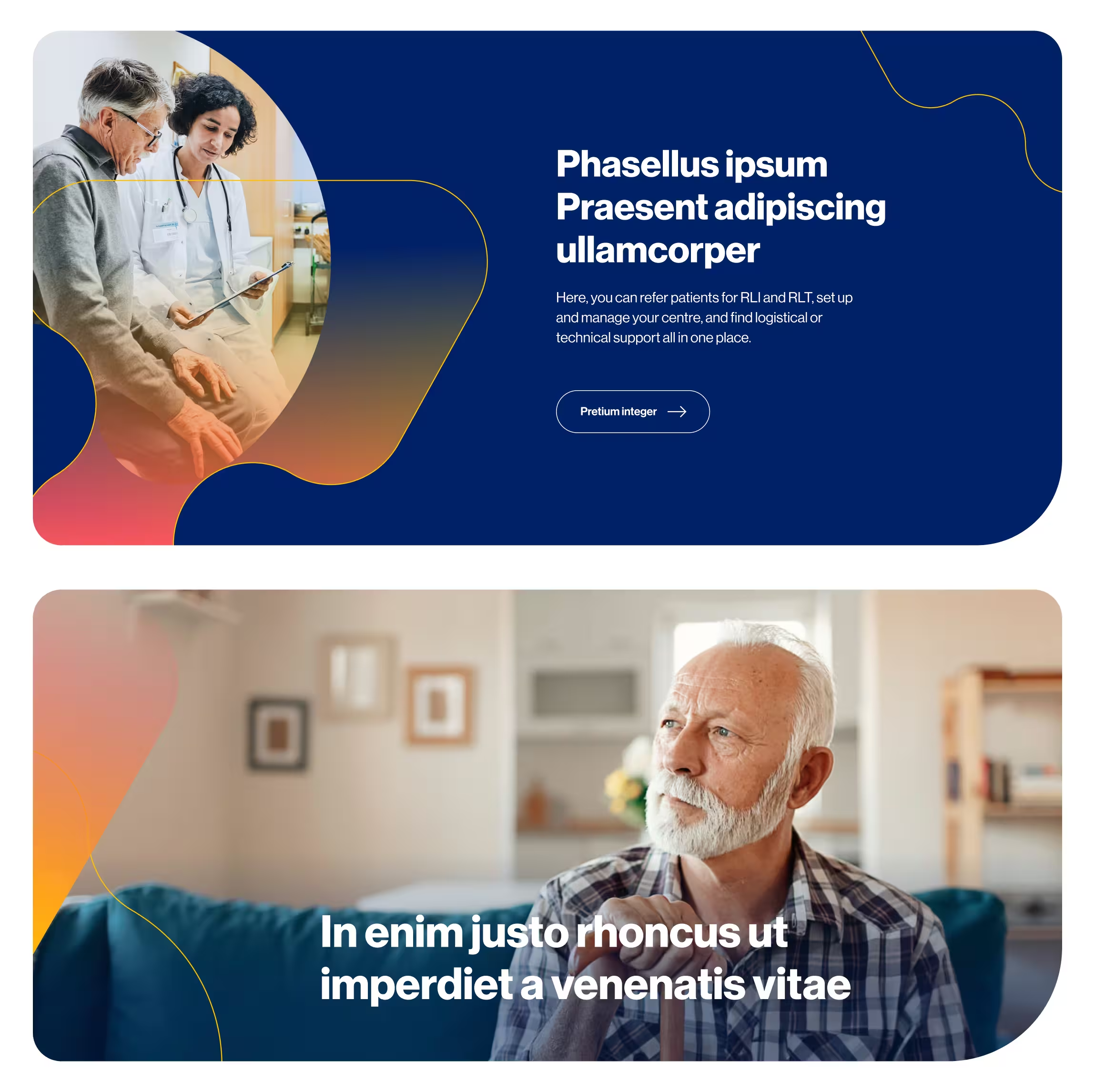
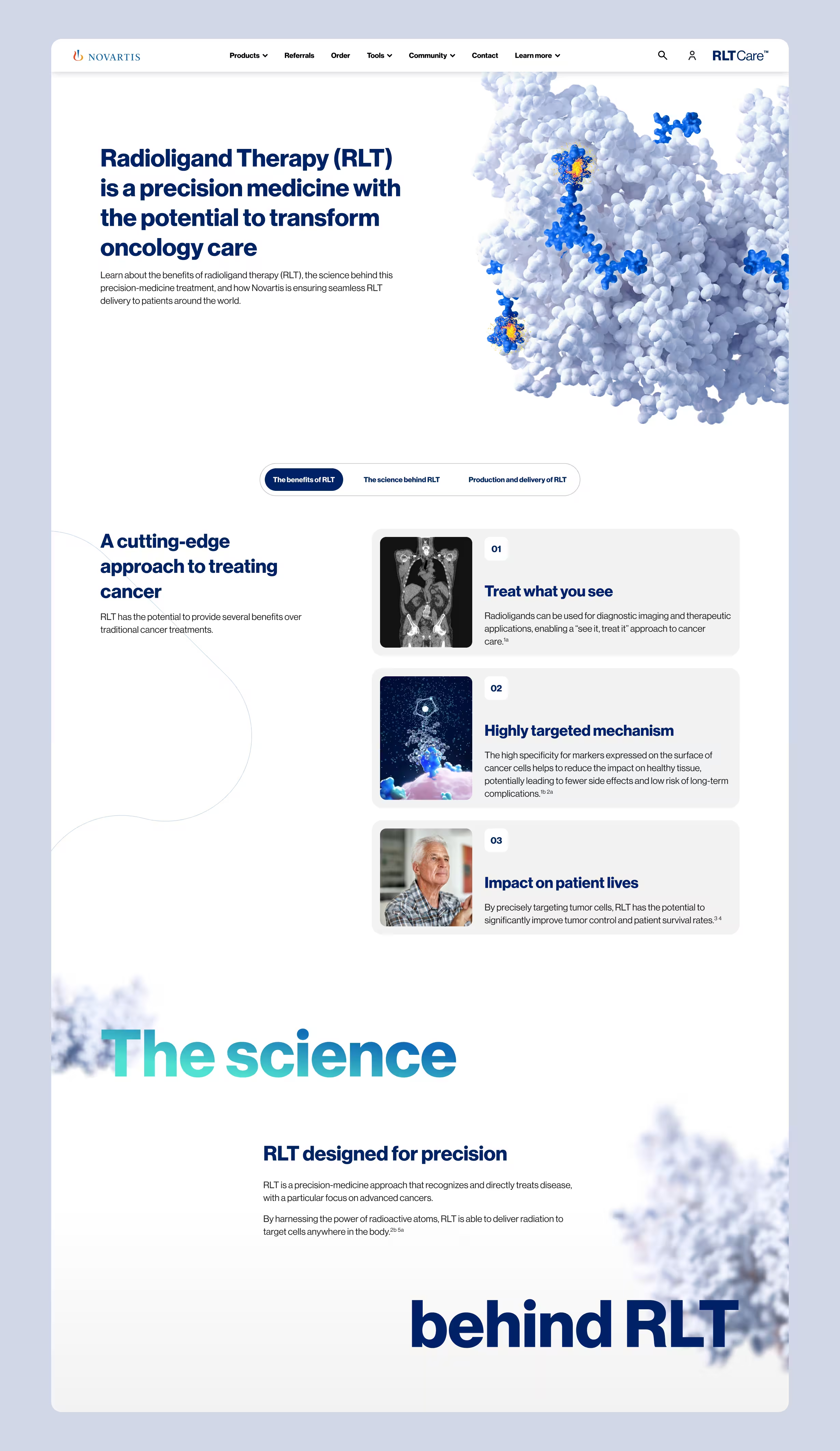
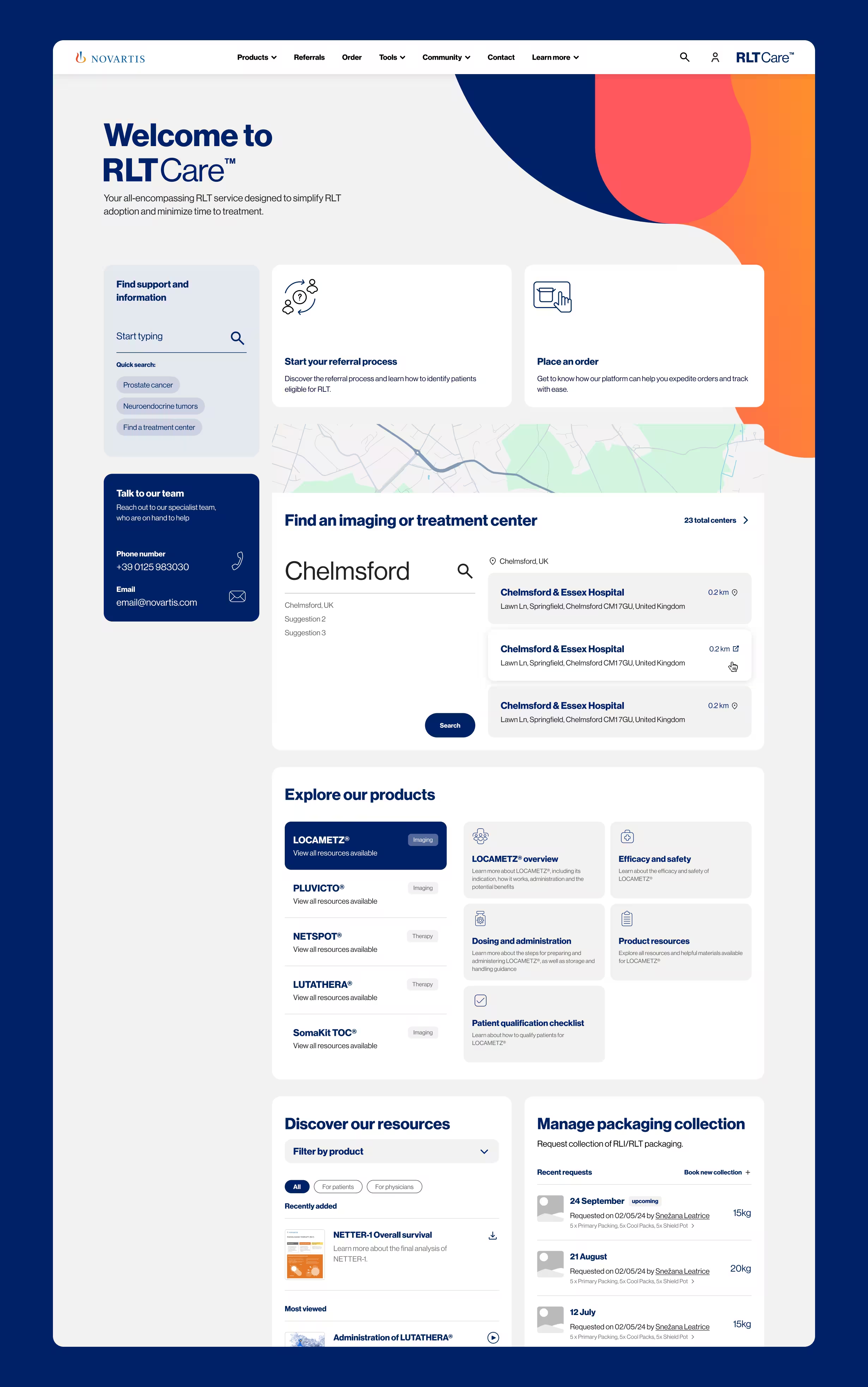
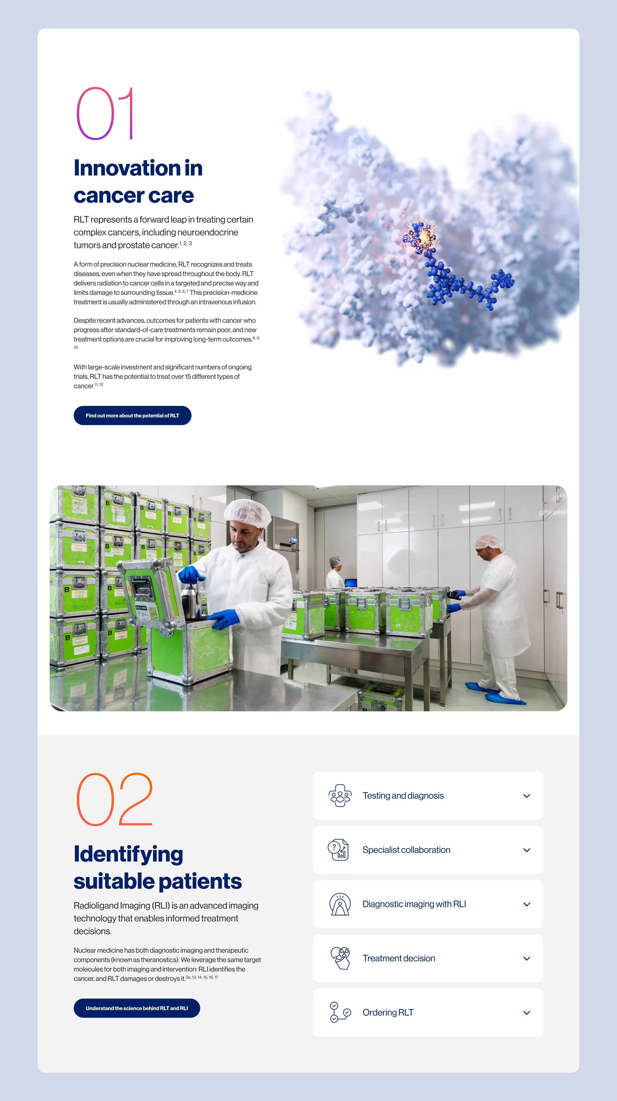
The project started without a defined visual direction, leading our team through several rounds of design exploration. I helped shape a clean and informational visual language that could support long-form medical content, using the established organic shapes and gradients from their brand to bring personality to the minimal interface.
My work on the global archetype included designing both pre- and post-authentication experiences, as well as several of the pages and UI components throughout the hub. I focused on creating reusable components that could work as building blocks across different layouts. This helped establish a modular system that maintained consistency while giving the site flexibility to grow.
Template guide
Components
The initial idea was to create something easily associated with a CMS; the goal was to make a business-friendly logo that would convey the brand's commitment to provide administrative tools.
For this reason, I decided to incorporate recognizable elements, composing of an arrow and a square to create a straightforward icon representing a web input.
The colors were chosen to represent the various tasks Input can achieve; with a vibrant color palette, these cool tones work together to compose diverse illustrations and designs. Individual colors were picked to embody the distinct categories in which Input can be used.

Templates
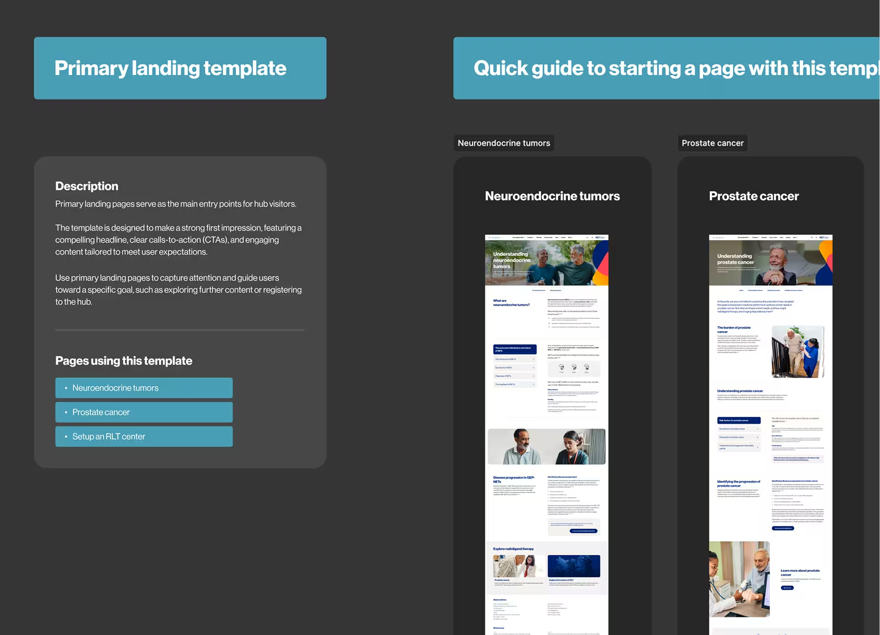
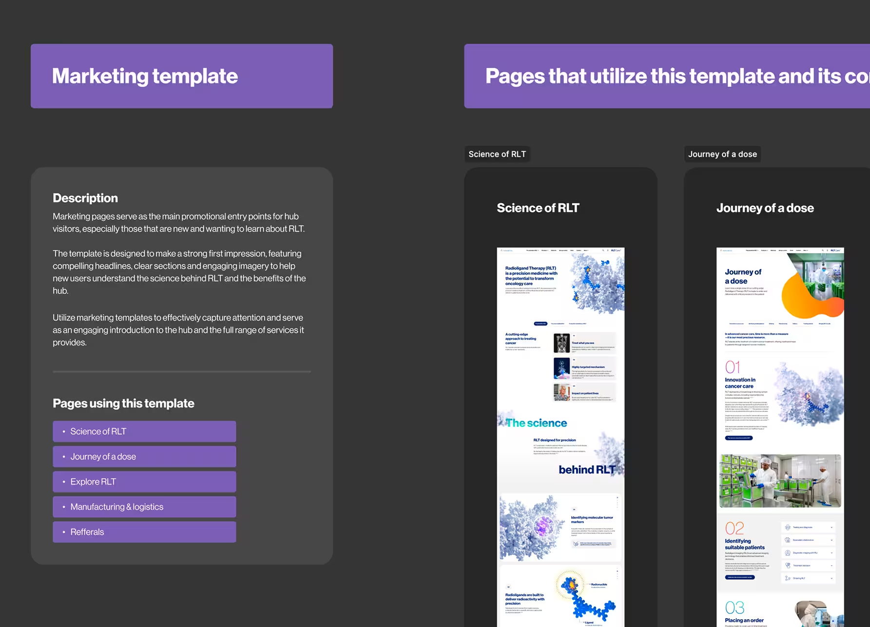
To help expand the global markets, there needed to be direction on where to start. I designed en extensive template guide that provided instructions on all the various templates that could be used to create new hubs. These templates included marketing templates used for commercial use, landing templates that contributed to the hierarchy of sections, and among many others.
Starter file
The starter file is a Figma file that can be used as a starting point for creating new hubs. It woks together with the tempalte guide to show an overall view and all the elemts needed to begin a new design.
Design exploration
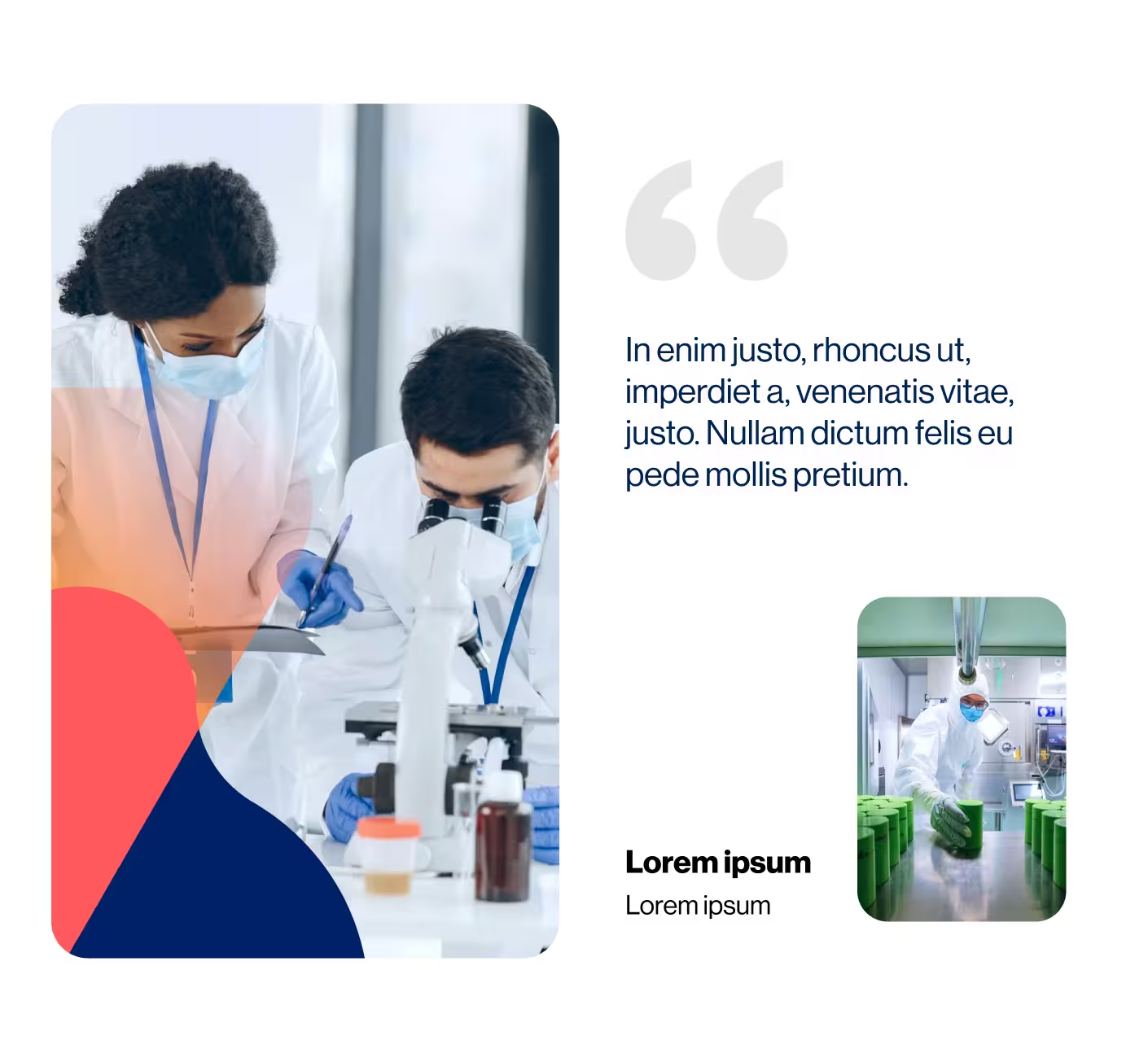
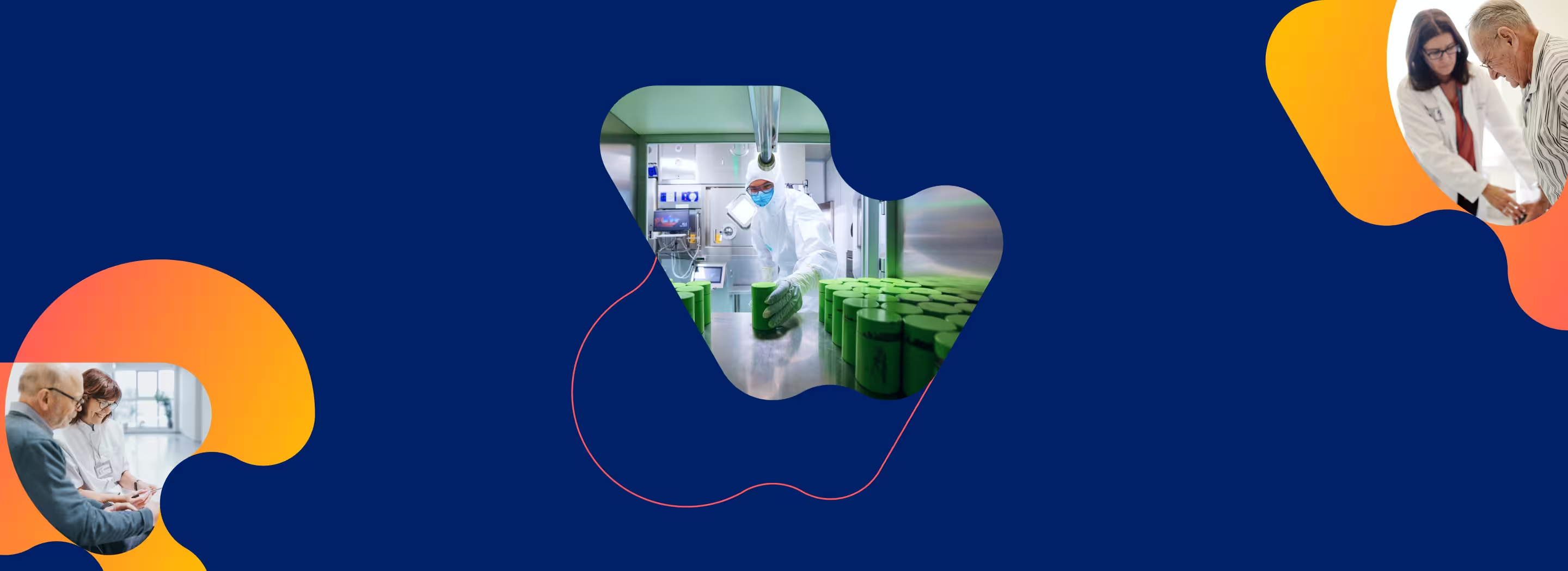
As a team, we explored different visual directions using the brand’s organic shapes, colors, gradients and imagery. My exploration focused on bold typography, color, large imagery and clean negative space to create a more positive and approachable experience.
The final direction simplified many of these ideas into a cleaner visual system, using blue and orange as accent colors alongside organic shapes and imagery.